I am here to say progress is okay! I have many people that message me with design questions and creative road blocks when they are doing a renovation project. I totally get it…because I am just the same. It has taken years for me to find my style, implement it, and critique it. I am seriously my biggest critic and I think that’s not a bad thing. I have learned that critiquing myself allows me to grow. I don’t think it’s good to tear ourselves apart especially when it comes to appearance or maybe things we can not change in our lives. When it comes to anything that you know you can work at and want to be better at, then working on it and critiquing your work, your conversation, or your attitude could be a great place to be a little pickier. This life is about growing…if we keep doing the same thing without results then that means we’re not trying hard enough. We are just all a work in progress and whatever you feel talented in or passion about, then you should 100% continue to work at that and improve your skills.
So that leads me to today’s French Kitchen post. I am constantly craving that cozy pulled together feel of a French Kitchen. I love all the tools on display, warm contrast, minimal feel, and vintage elements that a French Kitchen portrays. My kitchen has the bones of what I designed 4 years ago to be a “French Kitchen”, but there are small tweaks that this big critic can’t help but notice. You may have remembered that last year we swapped out our marble backsplash behind the range for zellige 4×4 tiles from Riad, to create the old-world look. Most French kitchens I see have marble counters, but their backsplash is usually a simple square tile not usually far up the wall. Sometimes it’s patterned, textured, or just a simple white. Either way it always looks fabulous and so after falling madly in love with the zellige look I decided to swap the marble for something a little more ‘old world” feeling. Also, if you remember the marble had quite a blue hue and made me nuts! Again, work in progress….little did I know 4 years ago that when you put marble vertically it picks up light differently than it does on your counters.
BEFORE Tile:
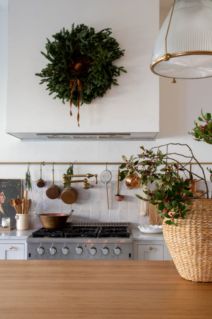
The marble had to go (though we salvaged it for a project down the road) and we swapped it with the zellige. Hubby and I installed it ourselves, after having a professional remove the marble for us. It was really very easy and we got it up in a few hours. Now, the big debate for me was that I really wanted a horizontal line. It seems to be trending in design currently and I loved the look of that. I felt it would elongate our backsplash and provide more of “designer touch”. We decided on 5 rows (since everything is better in odd numbers) and It would be equally distant from the pot rod as it was was from the top of the hood. Made sense to me! Then we had plans to put our pot filler upside down so it would hang lower. We finished up, put all our supplies away , added the pot filler back in and realized it was not a pot filler that could be swapped the other direction. I had watched another design couple do that and assumed that all pot fillers could flip the opposite direction. Well, ours didn’t and now my pot filler grazed the top of that horizontal line of tiles. Ugh…not what I was going for, but I did love the horizontal feel of the tile. So, we had another 30 tiles left and it would be just enough to make one more row…so one whole year of thinking about it…we finally went for it!
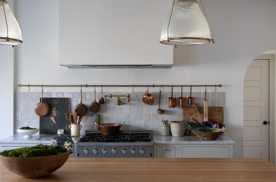
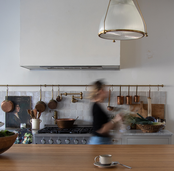
We had just finished the tile behind the sink in the candle studio and we figured while we had everything out; grout and mortar might as well just get this row done too.
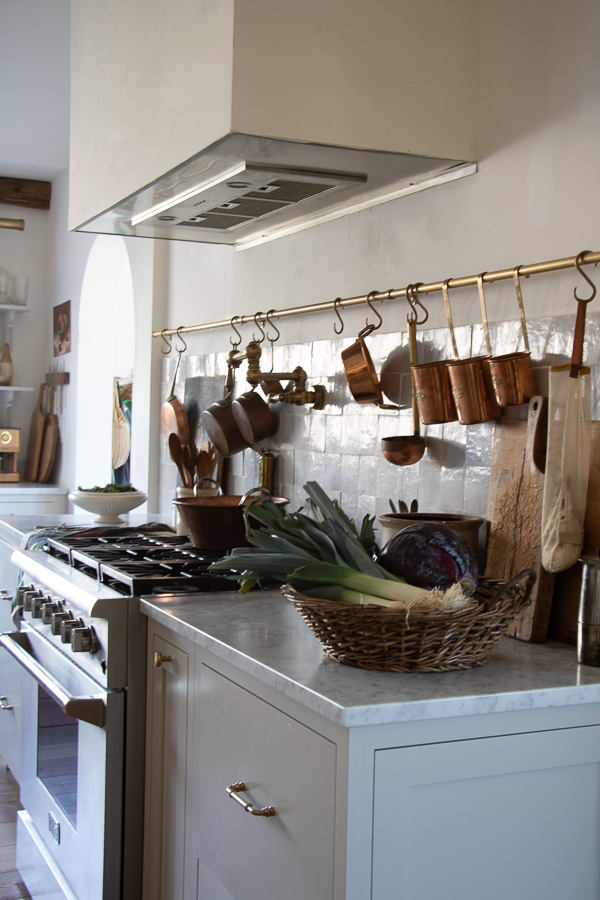
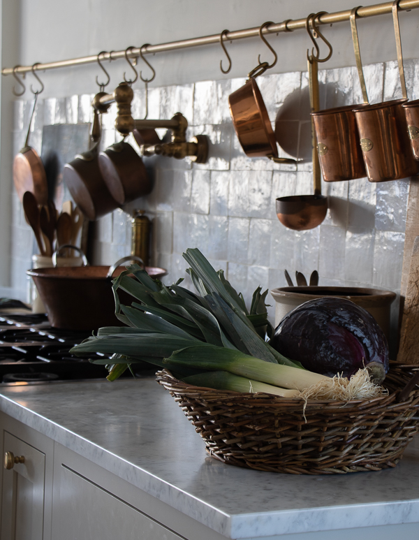
I can happily say that things take time and that it’s okay to let your vision take a year. I think if I did it right away I would have never known that one simple line of tiles more could make such a difference in the balance and symmetry of the backsplash. Now there are still a few more things I am tweaking and sometimes I have to remind myself I am in a “new build” I’ll never truly have that old world feel because moldings, windows, etc. are not “original” These are products from a 2018 home, butttt all the vintage pieces, texture, and old world finishes I can gather, can definitely make my “new build” feel a little more like my Old World French Kitchen style.
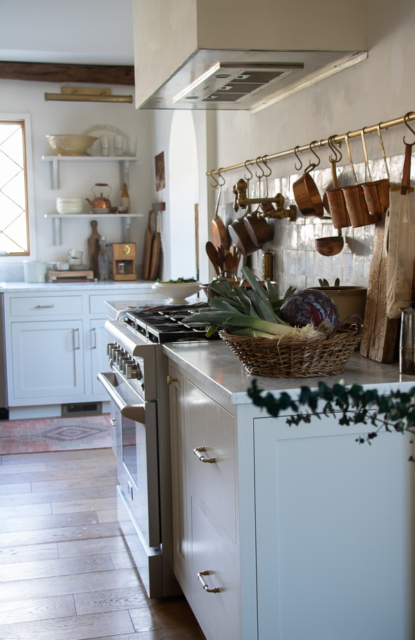

And to keep talking about change and making spaces in your home better…this hood of mine is still a work in progress. I really want to update my vent hood and make some type of change. I found a possible temporary solution, we might try this week, but something about the ceiling height and clean on this hood is a love hate. I do think most of the space will feel better when we finally have ceiling beams. We’ve been talking about that since before our renovation was done. Hope this inspires you all that it’s okay to keep working at something…whether that’s your home or something else in your life.
Have a blessed one!
Deb


Your kitchen is so charming. I agree the added row of tile completes the look. I love all the warm copper and wood to give that Old Word feel. Is the pot filer antique brass or unlacquered brass? Could you tell me the brand and source?
Thank you! You are right it is the little tweaks that sometimes make the biggest differences.
Enjoy!
Your kitchen inspires me ☺️
I agree, the fifth row of tiles definitely completes the look.
Yes! On thé tweaks ???? I’m still tweaking as our home is being built????
Thanks
Love love love your kitchen Deb. I agree, that one row of tiles pull that space together. I am saving this post for referencing when I do my kitchen this year. Beautiful work and style. ♥️
Classically beautiful. Love the added tile, the less cluttered look. Your copper is pretty fabulous!????
Thank you Cathleen
Look AMAZING!!! Thank you for sharing. Your home is so inspiring!
Love your little tweaks–such big impact!
I’d love to display some of my copper but I’m struggling to find a pot rack bar that I like. Could you share where you sourced yours from?