Our primary bath has been probably the longest makeover yet in the house. We had a lot of setbacks with the plumbing issues and insurance money. We are finally in the home stretch with one more piece to go for the major Reno part…but until then lets share what is done!
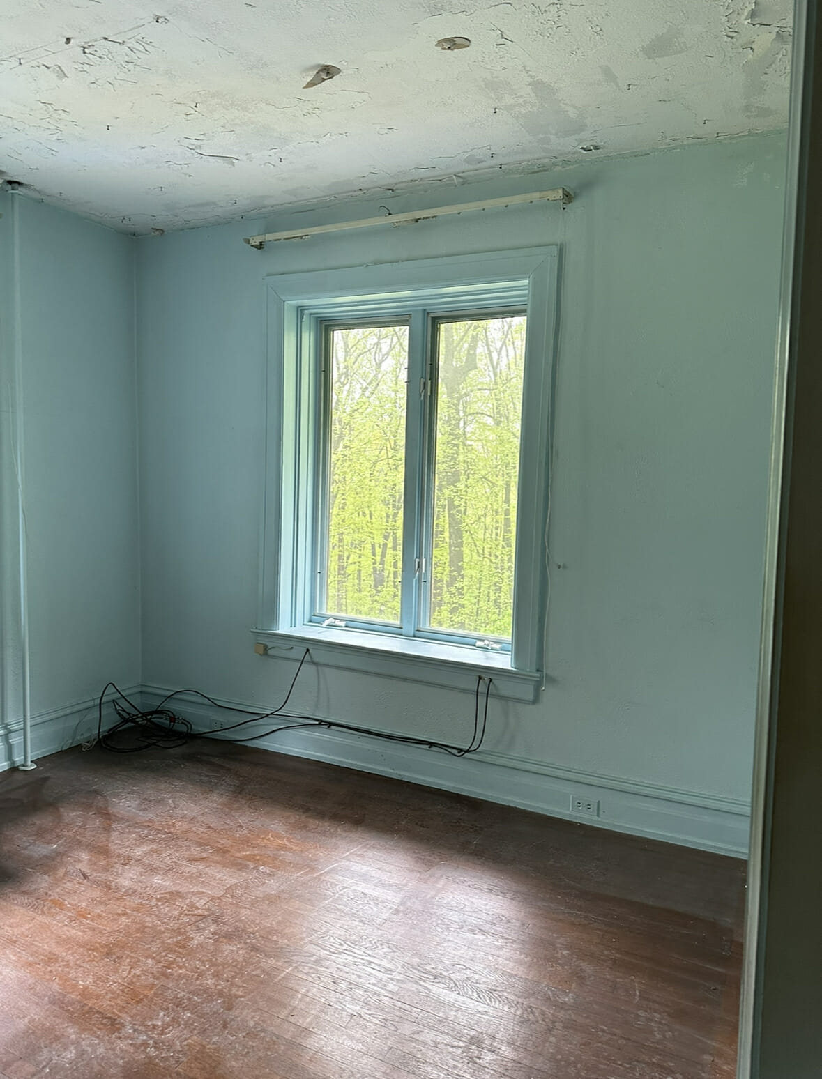
Here’s a reminder of what the room looked like before, it was the sitting room in the primary which I believe was the original dressing room. With the leak that happened we decided to change this into the bathroom. There is a bathroom directly upstairs above this space that had a major leak two weeks after closing on the house. We had insurance cover most of it and so we decided while walls and ceiling were open lets just make this the bathroom suite.
I selected details like this wallpaper, black trim and ceiling, and some bold textured choices with the tile. We collaborated with Short Hills Tile on this space with these gorgeous zellige black tiles. I knew the wallpaper would be a bit risky in a space where makeup is put on and teeth are brushed so I stopped the wallpaper halfway down the wall and finished off with a these tiles. They were the perfect texture but classic feel. I really wanted this space to feel like updated victorian.
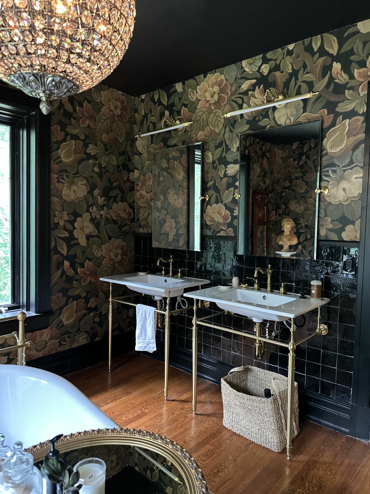
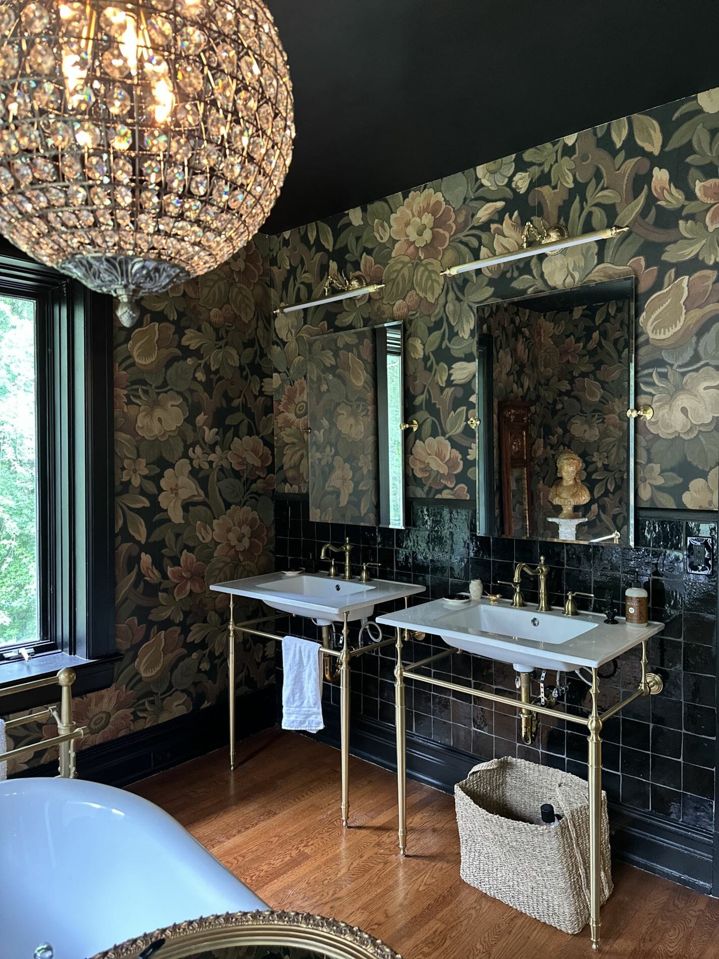
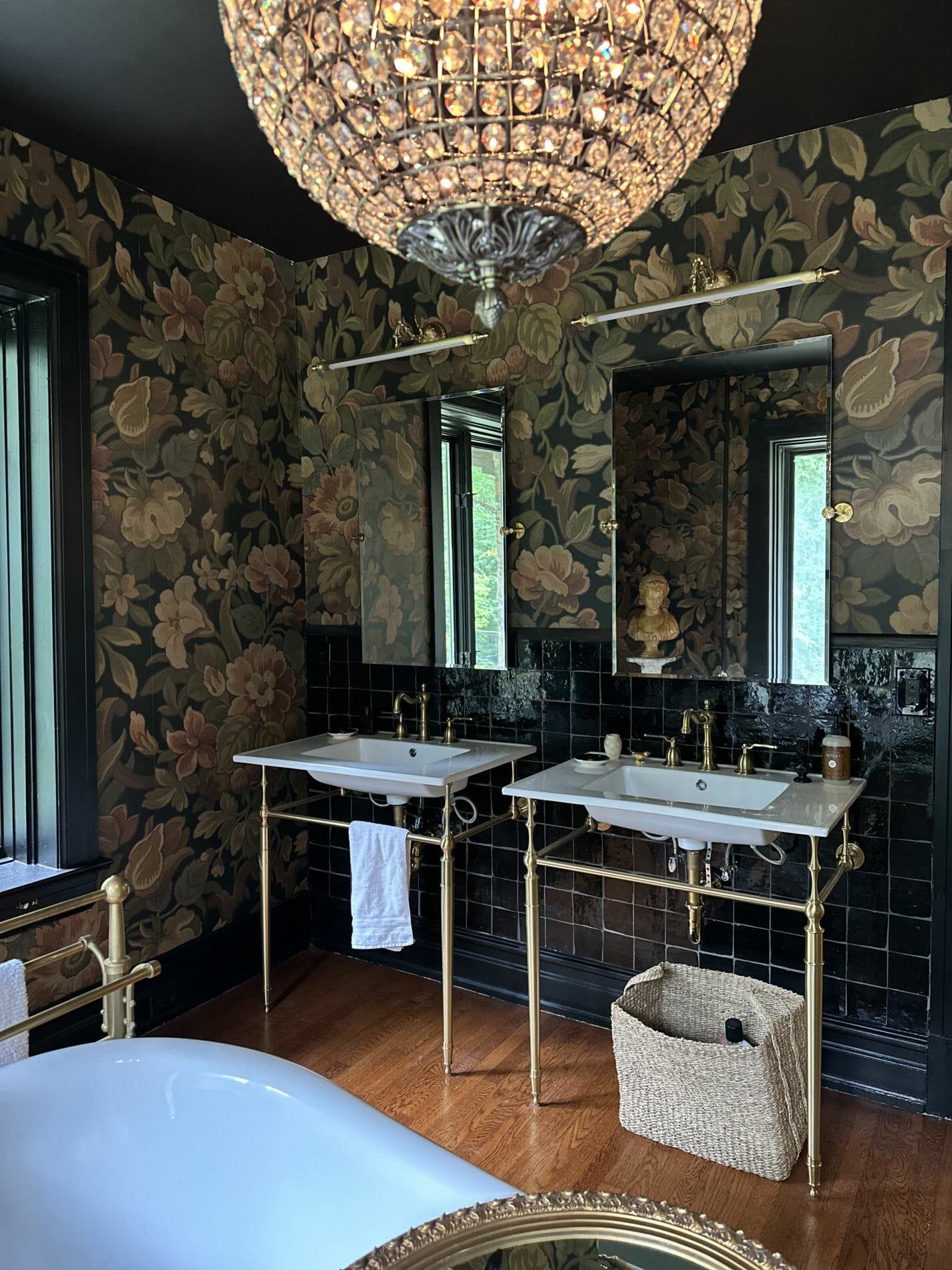
The grout we used was a charcoal so there was still definition but not too much with a lighter grout. With the more ornate details in the space I chose more clean lines for our mirrors and sinks. Not wanting to overdue the glam I think a great way is to choose your busier details and where to be more quiet and simple. The mirrors and sinks feel like a perfect match and I love how the mirrors overlay the tiles.
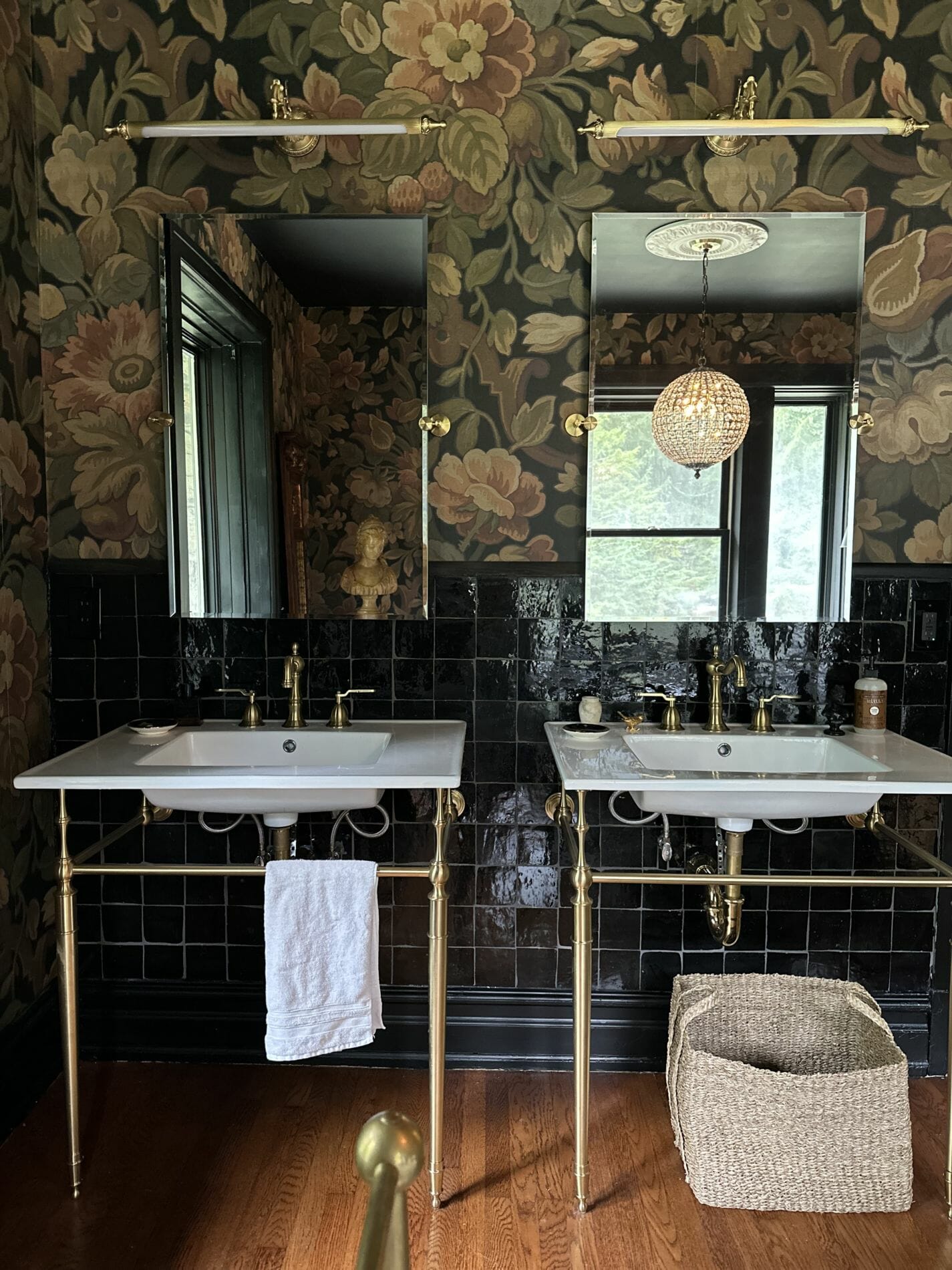
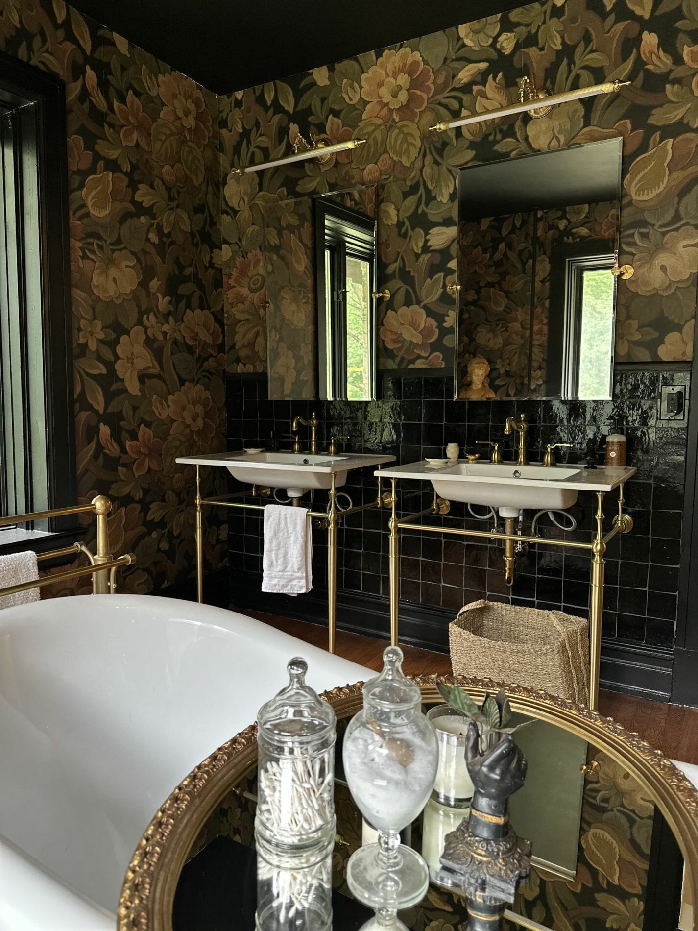
Lighting was fun to select for this space and I liked the option of these picture frame lights for above the mirrors. I will admit that they are not the best for putting makeup on because the overhead lighting does cast a shadow on your face (lesson learned) aesthetically though I love them!
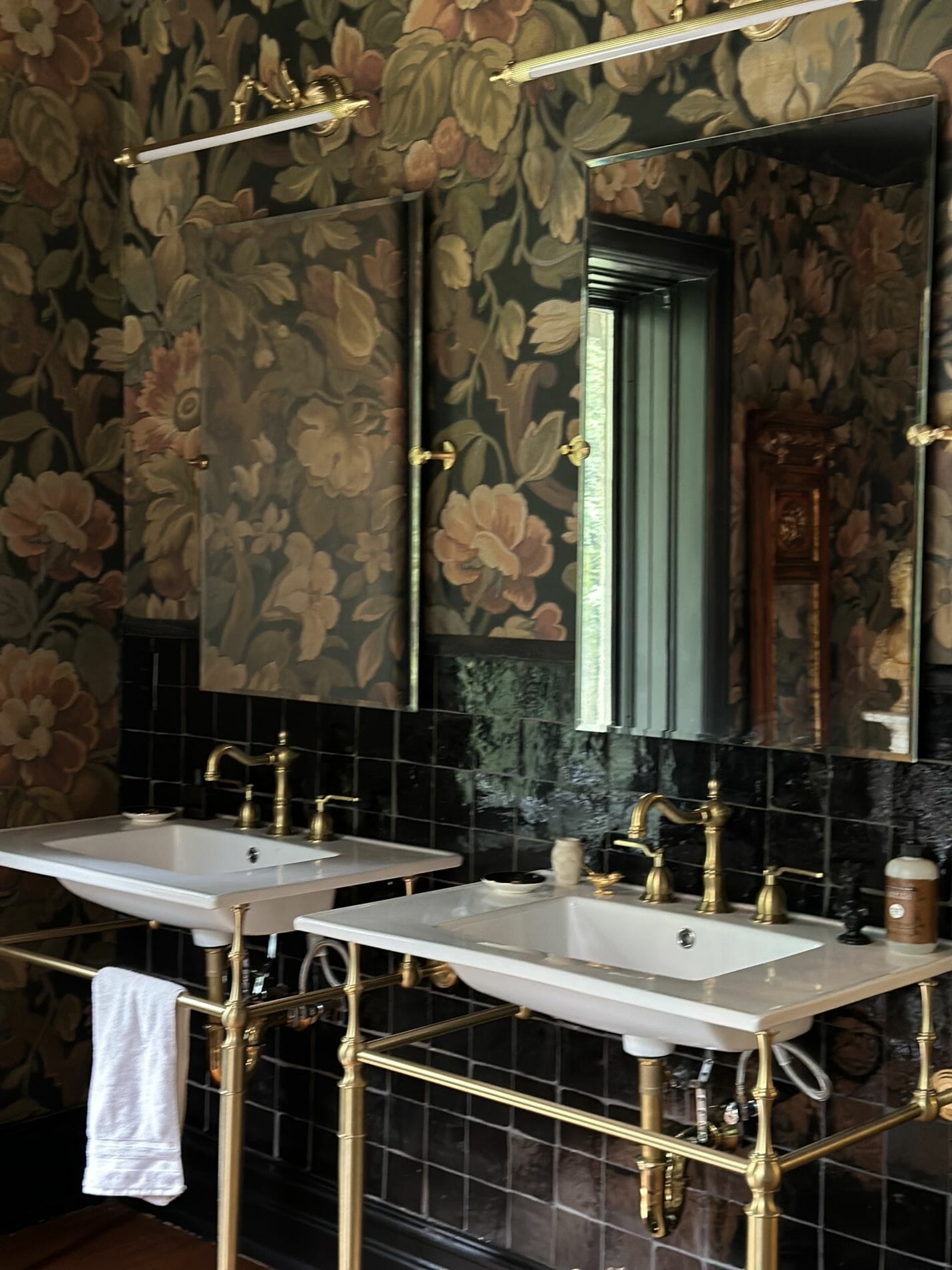
I could always add a skirted front to these vanities for more pattern and texture, but for now I like the open feel to it. I definitely see monogramed hand towels in our future.
More to come in this space, but I just love how this wall turned out and the best part is when looking into this space from our bedroom this wall is hidden. The only detail you see is the tub and chandelier which makes the room feel less “bathroom” and more like a floating tub in a room which I LOVE!
I will probably be back in about another month with more updates on this space.
Source list:
Tile: use code LAVLN15 (save 15% off)



3 Responses
WOW!!!!! This is ABSOLUTELY GORGEOUS!!!!! One would want to spend more time in the bathroom just to enjoy the beauty of it. I think of my bathrooms as necessities; they serve the purpose–utilitarian, and I am thankful to have them, but yours elevates a bathroom to a pure work of art!!!! I’ve done a bit of decorating in accessories and pictures, but I rent so can’t do anything major. Anyway, I LOVE THIS!!
Wonderful choices -you two did an outstanding job!
As usual i love it!
Absolutely stunning, my friend.