Selecting Kitchen Cabinets: Omega Cabinetry
I remember thinking back 3 years ago when my parents were getting their kitchen done and ordering their new quartz counters how much of a dream it would be to one day be able to have a custom kitchen with new cabinets and beautiful countertops. I truly could never envision us having a new home and new custom kitchen cabinets that felt like the ones in the magazines…but here I am counting down the days until this beautiful French Farmhouse kitchen is installed in our own home. I think the process has been so long and so stressful that hubby and I keep forgetting that there is an end goal and that the end goal will surpass all of our expectations and dreams. God truly has been so good to us and we know his plans are greater and here I am 3 years later planning for the kitchen of my dreams.
This is a collaborative post with Omega Cabinetry, though all opinions are 100% my own.
The Beginning of Kitchen Design:
Let me take you back to the beginning of our kitchen remodel design process and how we came up with the design, style, and manufacturer that we did. Way back in April towards the beginning of this home design I was talking with my family who work for a Kitchen design center up in North Jersey called, Merit Kitchens. You can check them out on Houzz and their 3 locations; Belleville, Montclair, and Totowa. If you specifically would like to work with my cousin Amanda she works at the beautiful showroom down town in Montclair and she is super knowledgeable and an expert in her field. Let me know and I would be happy to pass her email onto you. Anyhow, the process started with some “dream” kitchen designs that I sent her. This is how I tell all my clients and readers to start when you are designing a space. Gather a bunch of photos whether in a magazine or on a Pinterest board and start dreaming. Gather what you truly love about each kitchen and start to notice the trend in your style. Mine just happens to be lower cabinets, European Style, and what surprised me most was non-white cabinetry. Now I can’t say I do not like white cabinets, because I do! I just felt that the trend overtook so much of Instagram and what I was looking at daily that I started to loose that desire for a white kitchen. It could also be that my last kitchen was all white too and I just wanted something a bit warmer, and something that would contrast well with the white walls I have planned for the space and Carrara marble countertops.
Plan your layout and find a manufacturer that has the look and price range you desire.
Once we gathered the idea together and Amanda played around with some layouts, we started looking at Manufacturers that would work in my price range. Fortunately, being family I already had a family discount going my way. I know not everyone will have that, but I do want to be transparent that the cabinets did already have a lower ticket price to work with. Well, Amanda shared some of their highlighted brands in their showroom and one that stood out the most was Omega Cabinetry. The quality of the showroom piece and inset cabinets that were on my “pretty-please” list, but the cabinets sold me! Omega’s cabinets not only had the option for inset, which was really important for me, but it also happen to be one of the few “custom” cabinet lines that were in a more affordable price bracket. The quality and style was all so important for me while still working in my budget…gosh sounds like a lot to ask for…but we sure accomplished it with Omega.
What is inset cabinets?
Inset cabinetry is when the doors and drawers for the cabinet fit inside the cabinet face frame openings. Just imagine a more furniture like appearance with the doors and drawers tucked into the base with a more seamless look. Keep in mind this is generally a look you can only get with a custom line such as Omega and has an upgrade price.
The Design
We started looking into the colors that Omega had available and so we popped over at the Merit Kitchen Totowa, NJ showroom. The showroom there is a bit larger and had a full kitchen available to see along with the full collection of color and stain options. One of the other selling features that I loved about Omega was that they also offer a custom color option. At this point in the process I wasn’t sure which direction we were headed in so I liked the possibility of choosing my very own color and having that made just for our kitchen. Though after looking at the beautiful display of colors I narrowed it down to Meteor and Magnolia (go figure). Both colors offered that “greige” color that I had truly fell for over time with looking at so many cabinet color options and one just had been a bit more greige and a bit less warm and that’s the Meteor. Believe it or not we were set on Magnolia for maybe two months straight and last minute I went in a different direction because I was a little worried about the Magnolia being a bit too warm and maybe having a little yellow in it. We also bounced around the idea of doing a different color island but ultimately I just went for the all one color since I would be switching up the countertops on the island and I thought that was enough contrast. We chose a puritan door with concealed hinges to keep with a classic look and some of the drawers will have a clean flat panel which will truly create that “furniture” look to the cabinets.
Cabinet Organization Options
Making the decision to have all lower cabinets we risked some storage options. Fortunately, our kitchen has a lot of lower cabinets and drawers and we were able to create smart ways using Omega’s cabinet options to create ways to store plates, cookie sheets, spices, utensils, and more. I will be sharing more about that and the function of the kitchen once installed.
Talking points on painted cabinets and the WHY OMEGA?
Omega uses a conversion varnish opaque paint finish on their cabinetry, considered by many the best type of finish available. When a paint is applied to wood it does not penetrate wood as stain does, paint only adheres to the surface of the wood. In seasonal changes, the paint that adheres to the wood, expands and contracts as different rates than the wood. This might be visible in hairline door joints. It’s also something I wanted to make sure I could educate you all on and know that when ordering painted cabinets you should also be aware of possible chipping over time. There is always the possibility of corners being nicked as well. Now, you are talking to someone who believes in white walls and sofas. I have also painted too many cabinets myself in the last 5 years…so for me though I know it’s something to really think about…I’d take the risk for the beauty of the painted goodness any day! Either stained or painted cabinets can split and ding over time, but another fear with painted is they are more visible. I do have to say that having wood stained cabinets crossed my mind but more so for the design and not the less maintenance idea. Did I mention I am also doing honed Carrara marble in here…yep I’m a design risk taker and I know my family will probably take my house down over time, but you love what you love, and quartz wasn’t doing it for me! I’ll have to embrace that character of warn Carrara over time. (I KNOW I’M GOING TO GET SOME NAY-SAYERS ON THIS TOPIC).
Selling Point on Omega Cabinetry:
So, I had a designer that really helped me see the difference in the cabinetry and what I could afford on my budget. Budget of course is always most important but you also want to be sure you are getting the most for your budget. The Merit Kitchen’s team really steered me in the direction of Omega because they believed in their quality and the fact that I could get a lot of those wish list items with Omega for a more affordable price then some of the other custom lines out there.
WHY OMEGA?
An affordable option for a custom line of cabinets.
The beautiful stain and color options that made selecting easy.
The option for custom colors.
The endless opportunities to be able to create custom ideas for the kitchen such as a slender bookcase and an island with bead-board and open storage.
Omega’s attention to detail, such as the smooth finish and dovetail joints on their drawers.
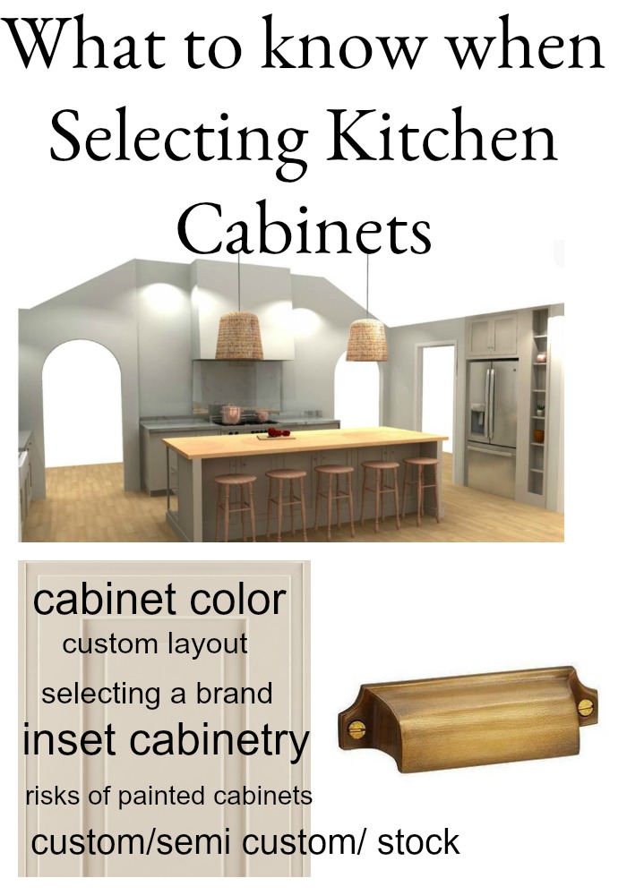
So, now that I’ve done all this chit chat and you all are probably wondering what in the world is this kitchen going to look like. Well, fortunately I have a pretty good way of showing you with this custom 3D rendering. I know it totally does not do the kitchen justice yet, but it gives us all a pretty good idea of what we are in for!
Drum Roll….
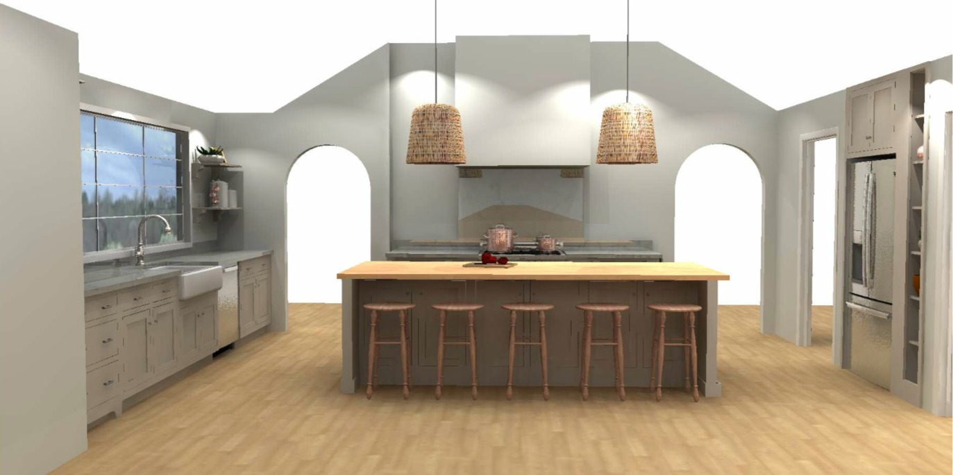
The arched doorways and the clean sleek kitchen give to an old world feel. Nothing too fussy but a dramatic look for sure. I love how open the kitchen is and one of the desires I had for this kitchen was for it not to be an L shape. I wanted something that felt open and airy with a place for everything. We chose to tuck the refrigerator into the wall nook and built a custom bookcase for decorative piece and upper cabinets. The hood wall I wanted to be open with just a dramatic Carrara backsplash and sleek hood. I love the idea of the beadboard trim and decorative shelving that adorable little nook we designed to the right of the kitchen perfect just for style.
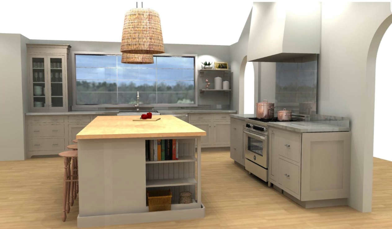
Warm butcher block countertop on the island and timeless Carrara on the surround. I love the mix of counters with the greige cabinets. The peek of bead board on the bookcase gives a nod to that country style kitchen with French style in mind.
On the back wall we plan for some open shelves and the opposite side to a hutch to create symmetry that appears like a furniture piece. We even decided on exposed hinges here to slightly separate this “piece” from the rest of the cabinets.
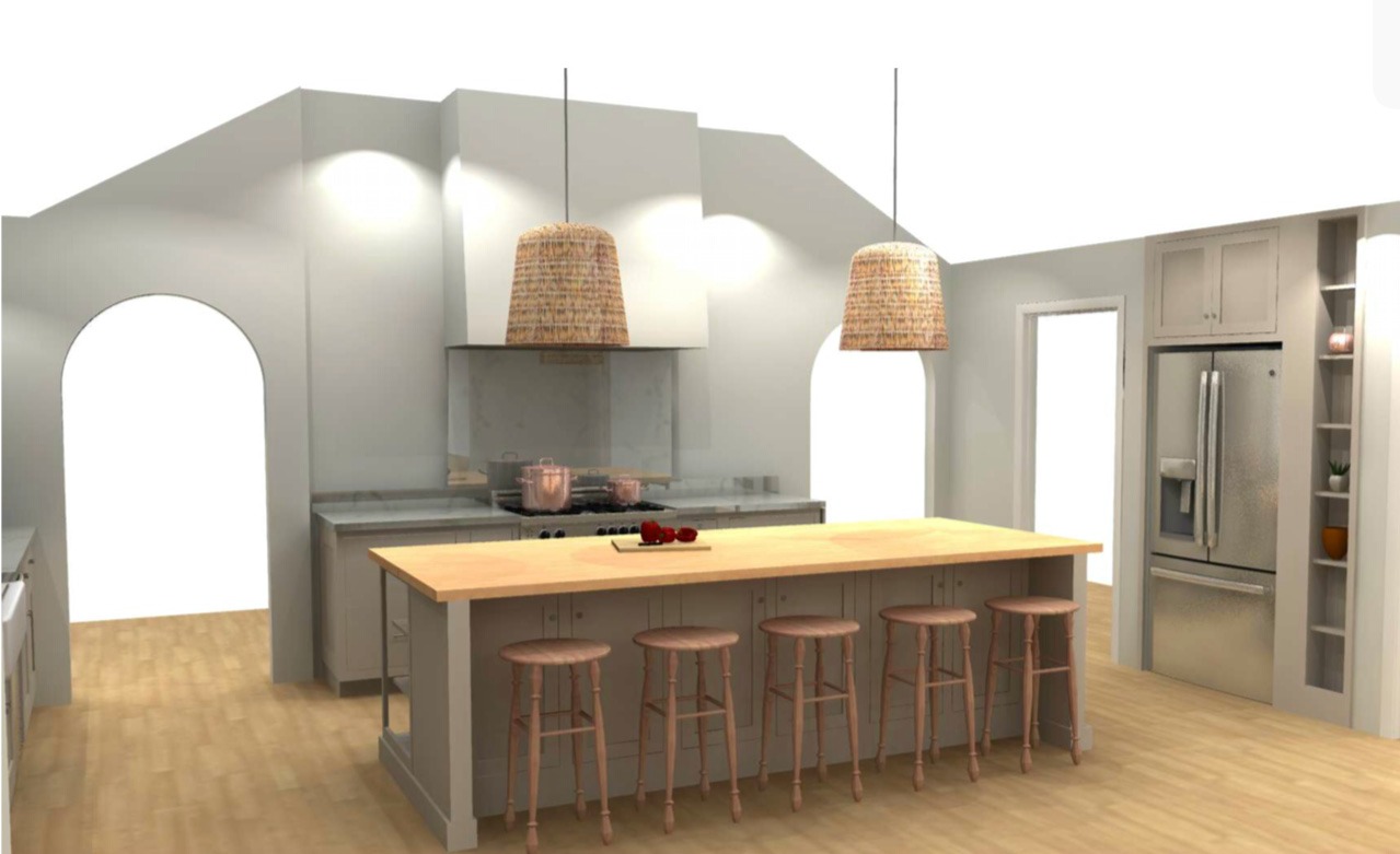
As for the other decisions for the kitchen, we will have white walls, and warm wood floors and warm wood stools. I plan to order wicker pendants (though I’m afraid that’s getting a bit trendy now too) but I think all the warm wood, greige cabinets, and white walls will definitely make for a French inspired kitchen. Of course brass hardware and copper pots are a must and then a simple drywall hood painted the same color of the walls.
I’m excited to see it all come together in hopefully six short weeks and be able to cook and bake in my dream kitchen! Quite the upgrade from our current RV kitchen.
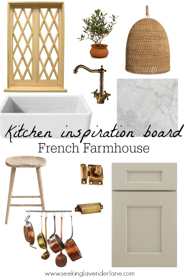
I pulled together this design board to really create a vision for the look and texture and finishes that will bring this kitchen to life. With inset cabinets this kitchen will really create a furniture like feel to my cabinets and that old world craftsmanship. Other details include diamond grid windows that I plan to stain to match the wood in the room. I’ve got a white porcelain farm sink selected and of course stainless steel appliances that I’ll be sharing in another post shortly. Feeling beyond blessed and counting down the days that our Kitchen cabinets arrive and we can start unpacking our boxes and feeling at home.
Please Pin
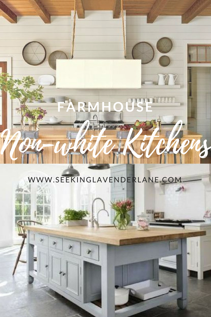
Non-White Farmhouse Kitchens



Deb!!! I’m drooling!!! Your kitchen rendering is seriously amazing!! I am so excited to see it all installed!! You did an awesome job designing everything!
Thank you so much Lindsay! That means so much xoxo
Absolutely beautiful Deb! You are such a great designer! Can’t wait to see the final product!
Thank you so much, I so appreciate that!
So excited for you and your family! Love your inspiration board! Exciting time, enjoy it!
Thank you so much, we certainly are pinching ourselves!
Yay for a non white kitchen!! Excited to see it come together. Looking forward to seeing a kitchen that looks different than the rest of the world. lol Like the plan already!!! 🙂
Thank you so much Lilly! Excited to switch it up a bit in the world of kitchens. The color is still light so hoping when it’s all in place it photographs like a non-white kitchen lol.
Awesomee selection! I love it so muchhh, pinning this now..
Thank you so much Kyra!
Beautiful!
Thanks Irma!
Very lovely and spacious, Deb. But I’m curious as to what the dimensions of the room are. The reason is that, to me, the refrigerator looks like it’s miles from the sink and the stove. It seems like that would be very inconvenient to me. Why would you choose to place it so far away from other main work areas? Just curious. I don’t like to take any more steps than I have to to get around my kitchen when cooking, cleaning up or putting things away.
Exercise, exercise! haha no I’m just kidding! It’s the only spot for it. With the size of the kitchen and the layout I decided on, I wanted the refrigerator to be set into the butler’s pantry. So this way it did not stick out into the room. We chose this location as the refrigerator wall. I don’t feel the placement is at all odd if you look at most modern designed kitchens today you will see same placement for the refrigerator on the right hand side of the room while the window is on the left and range centered on the main wall. Keep in mind the island ill be prep space for me. Today’s kitchens are the hub of the home. It’s all about making space for everything and place for the family to hang out at. So having a large kitchen was a must on our list and the layout will suit our family best.
Thanks for the lovely post, you have a great taste in interior design. I agree that the kitchen cabinets are one of the most important parts of the kitchen, because they define the general outlook. I’ve always been a fan of the combination light coloured cabinets and dark coloured countertops, the contrasting colours make the space pop. I also love the lighting fixtures, they look old school, but the material they are made from would’ve made them a fire hazard then, while now the lightburbs are much safer.
Jane @ Modern Housewives recently posted…The KonMari Method – How Japanese Minimalism Can Influence Your Life
aw Thank you so much Jane.
Awesome tips! The 3rd render of your kitchen design looks too good to be true! It would be a dream to have my kitchen designed like that.
Erika Ann recently posted…Production Process of Upstream Steel Products
Thank you Erika that means so much! We are still pinching ourselves that we get to have a kitchen like this in just a few short weeks.