Creating a true French kitchen with Zellige tiles from Riad Tiles.
I have been dreaming about a true un-perfect looking backsplash for so long! You might have been seeing these clay tiles around the design world called zellige, They have that perfectly imperfect look and come in different colors and sizes. I had my eyes on these way back when I was planning my kitchen 3 years ago. I fell in love with how European they felt and since I’m more about texture than color and pattern, they caught my eye instantly with their subtle texture and natural look. So you might be thinking…well why didn’t you add them to your kitchen 3 years ago then??? Well, I was very torn. I had fallen in love with a marble slab backsplash look and these and I kept tossing around the idea of both. That’s when we decided to go with the more affordable option which was the marble slab. We were able to use one of the slabs that we bought for our counters and have that cut down to 1/4 of an inch and it saved us a ton of money. To have someone install tiles and also the extra expense of tiles would have possibly cost us maybe $1,00 if not more. The counter installers just installed it with the counters and it was a done deal, no extra expense.
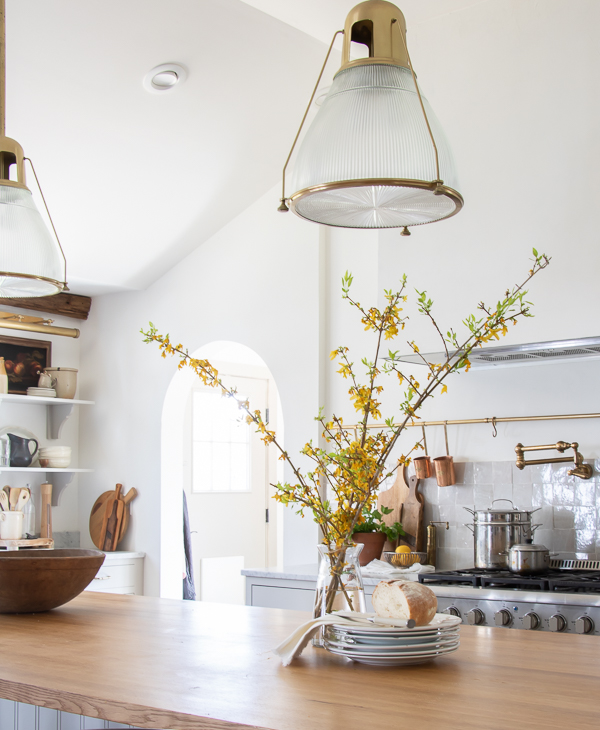
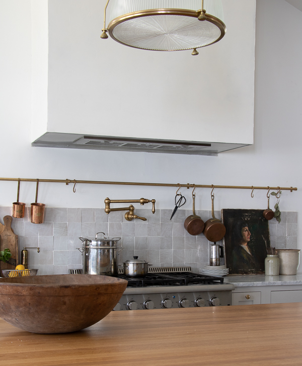
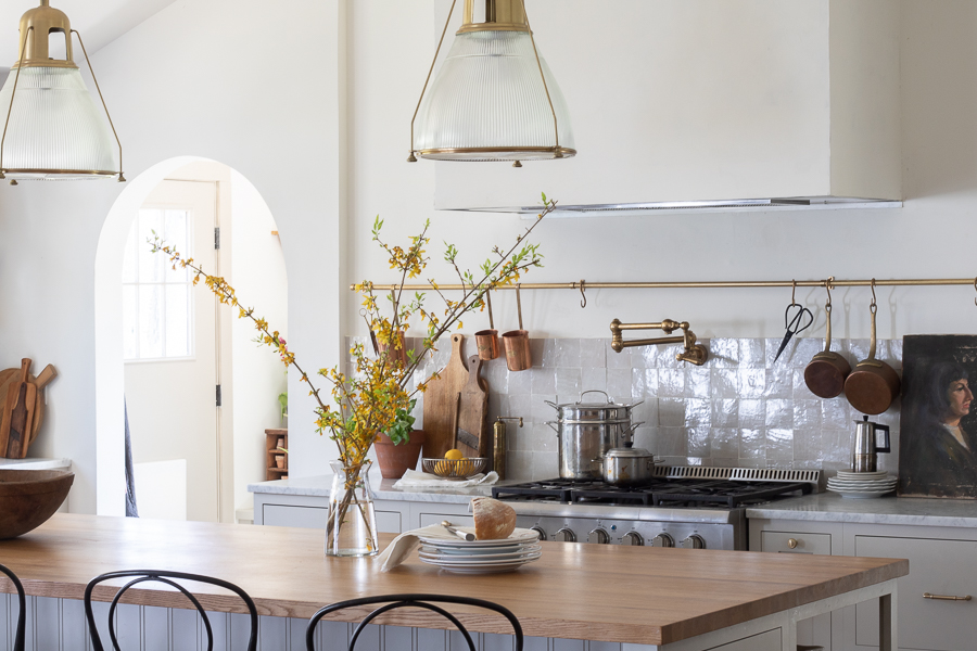
So why the change??? Well, after living with what I called the “blue marble” I knew it just was wrong for our kitchen. The hue of the marble read very cool and kept throwing off my eye constantly. I also knew the shape was wrong. Not having windows to each side of the marble or cabinets and then a large square hood made everything feel…square lol. I needed something that either worked better with the warmer tones in our house or more neutral that also complimented our marble counters. I decided to come back around to my love for the Zellige and that’s when after almost a year of tossing around the idea I finally decided to go for it!
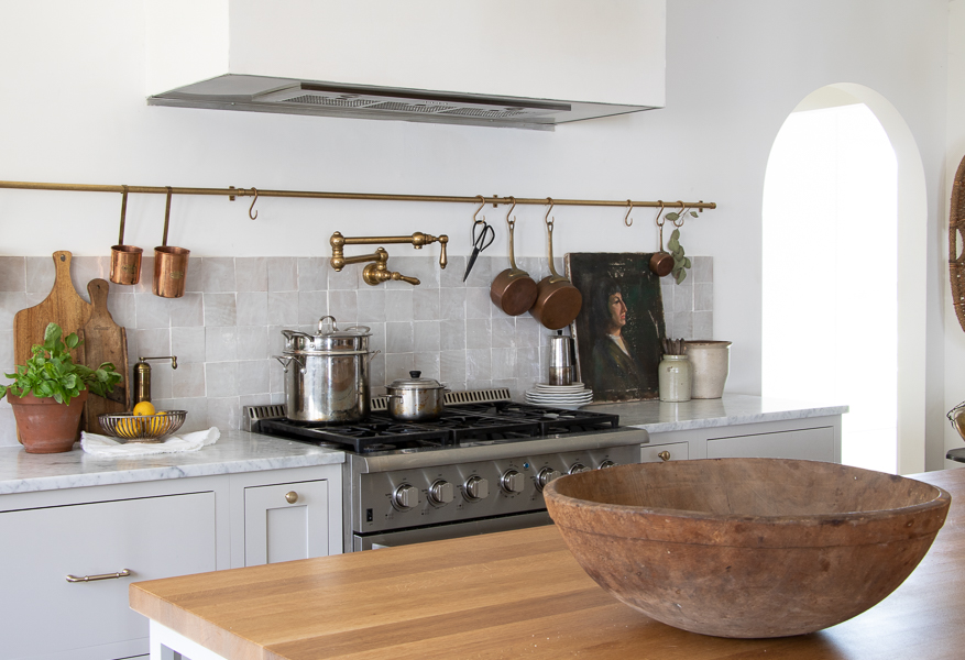
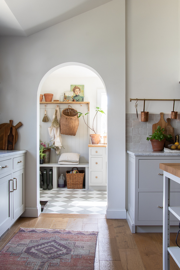
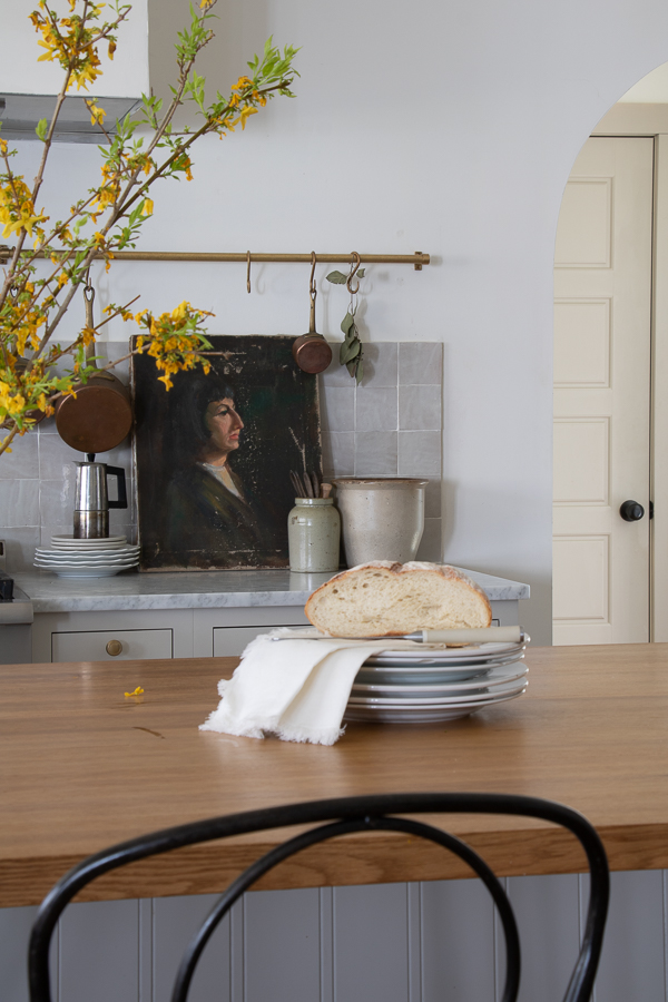
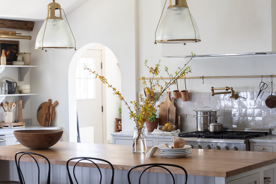
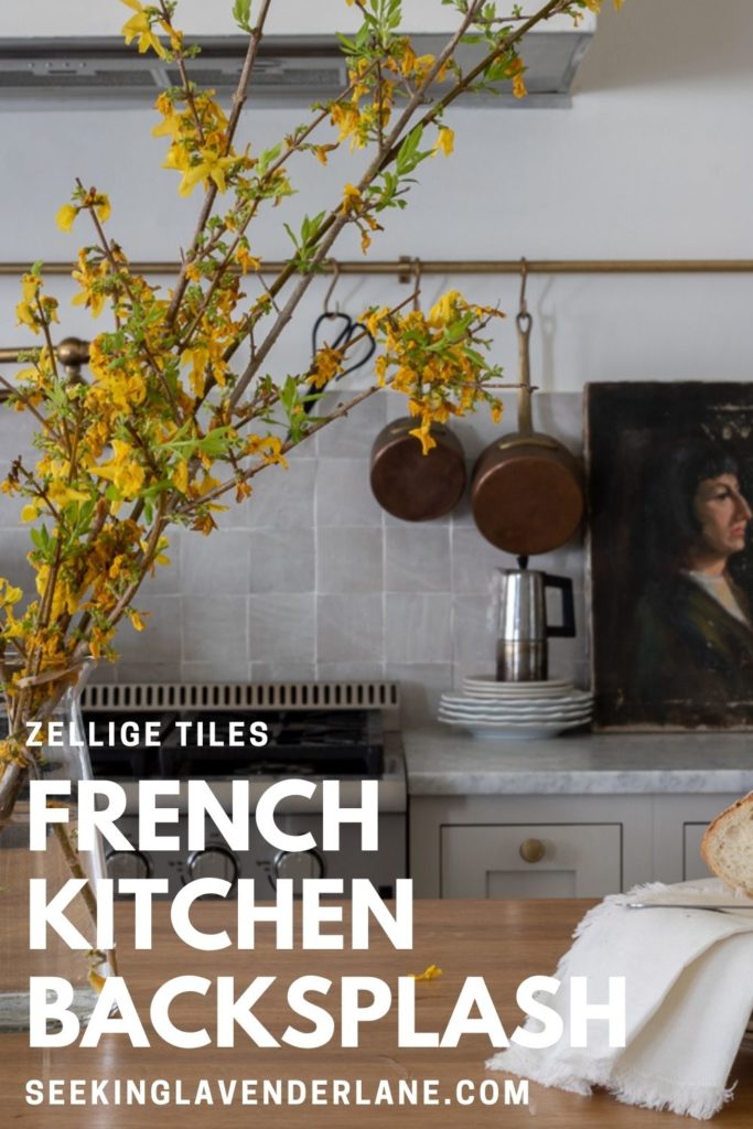
We ordered our Zellige “natural white” (yes they appear more gray so if you want more white go with the snow color) from Riad tiles.
We had a professional contractor who was working on our baesment fireplace at the time take down the marble for us and with a little spackling and a weekend of putting up the tiles ourselves it was finally done! FULL CIRCLE! I knew now that I wanted something that also did not take your eye up but make the kitchen look larger with more horizontal lines. We continued the horizontal look with the 9ft foot brass pot rack from Devol Kitchens.
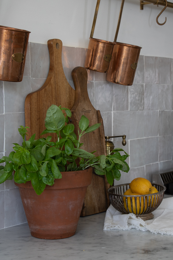
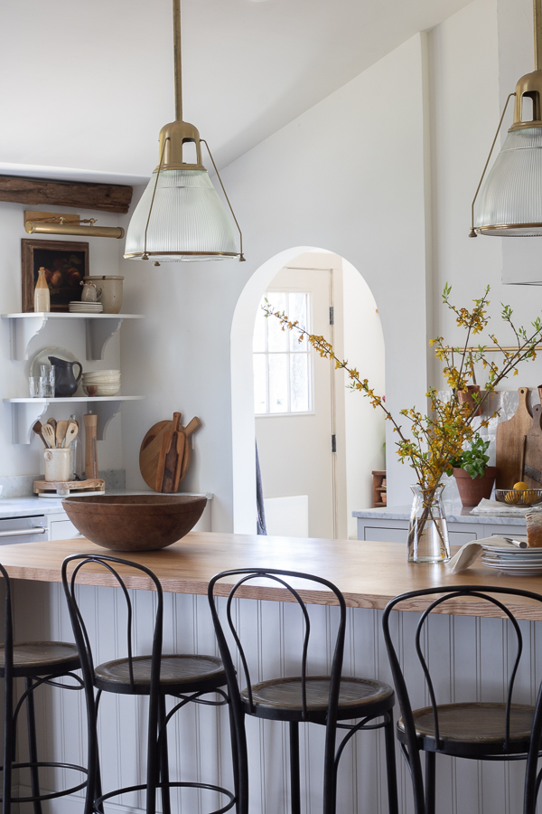
My kitchen feels more French utilitarian now and the slight sheen and wavy texture are just what this space needed. Of course adding some vintage accessories brings it all together!
Shop the Post!
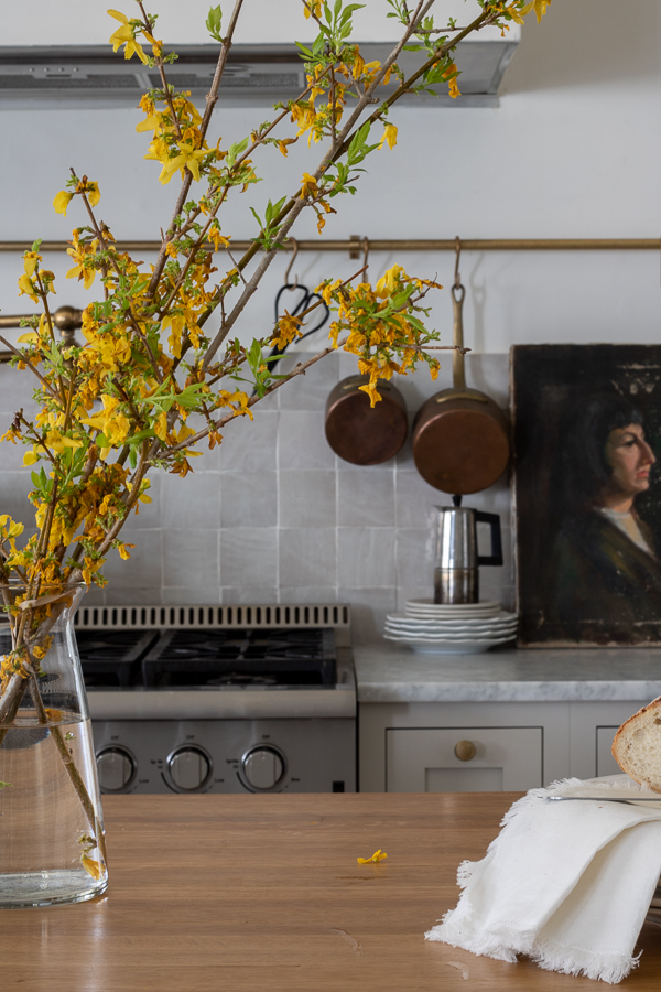
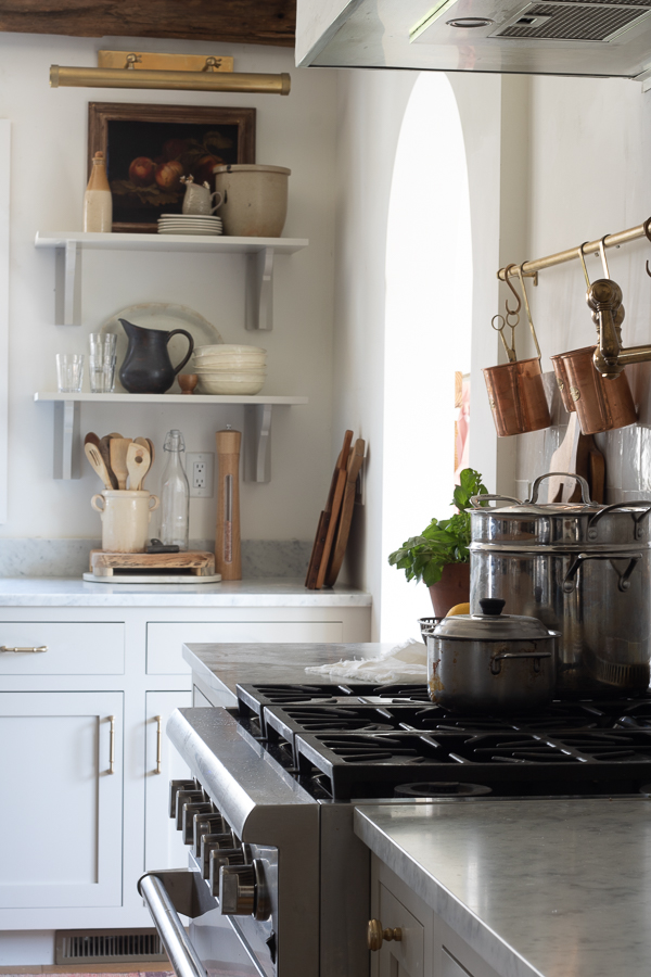
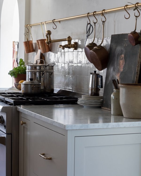
So what about the edge? I know I will probably get questions about this. Since currently the trend is to have this sleek drop off feel of tiles that create horizontal lines, we just grouted the edges of the tile on top and on the side, and it worked perfectly!
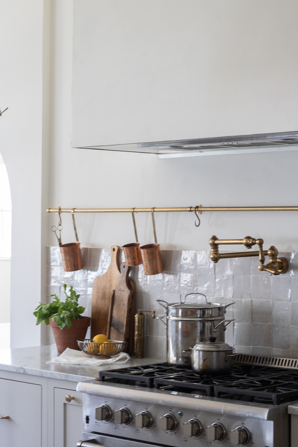
I shared more details on my Instagram account on adding the tiles and grouting, you can check that out HERE!
Please Pin



Looks great! Very European and cozy. Enjoy!
Love these new, old world French style tiles, and LOVE the 9 foot pot rack! Very Inspiring!
Thank you so much! it truly brings such character to a new build home
As I was reading your post, I wondered how the tiles would look with your marble counters. Everything looks great, though! Nice choice.
Thank you Tammie