The day has come that I get to share my kitchen with you all! There are a few minor tweaks we still need to do including getting our marble cut to replace a prep sink they put in incorrectly…but it’s 100% shareable! If you follow on Instagram then you probably have already caught the reveal…but for my blog readers or those that want to slow down and catch a tour through photos and words…this is for you!
I want to first start out by saying that your kitchen can look and feel like a space that reflects your personal taste and doesn’t have to look or feel like any other kitchen. This should be the space you feel the most creative and passionate about since so much time is spent in the kitchen. I wanted something that didn’t feel “typical”. I was striving for something that felt refined but also casual. I loved the look of unfit kitchens but also wanted something that didn’t feel to rustic-y in our victorian-tudor home. Its still a debate on what the architecture is.
One of the most shocking decisions I made was to do an all white kitchen! But…wait white kitchens are out… Yes, and no! White is always classic, but I wanted to do white in a different way. Really make a white kitchen feel like its full of character and charm and not just so faux farmhouse or builder grade. I hope that with sharing some of my decisions whether they are helpful in your future kitchen project or just help you think outside the box a bit when it comes to your next room makeover you’ll understand how details go a long way and though the description would be “white kitchen” its so much more than that…and that comes with taking just a bit more time to get the details right.
Lets take a look at what the “kitchen” looked like before. This was the original dining room in the house. I miss having that separate dining room its now shared with our living room, but when it came to making a vintage home, work for a modern family, moving the kitchen into our dining room (center of the house) felt like the best move! FYI our original kitchen is now the laundry room and the pantry/mudroom or as someone said to me recently the “clutter room” I love that and using it for now on!
BEFORE kitchen/dining room
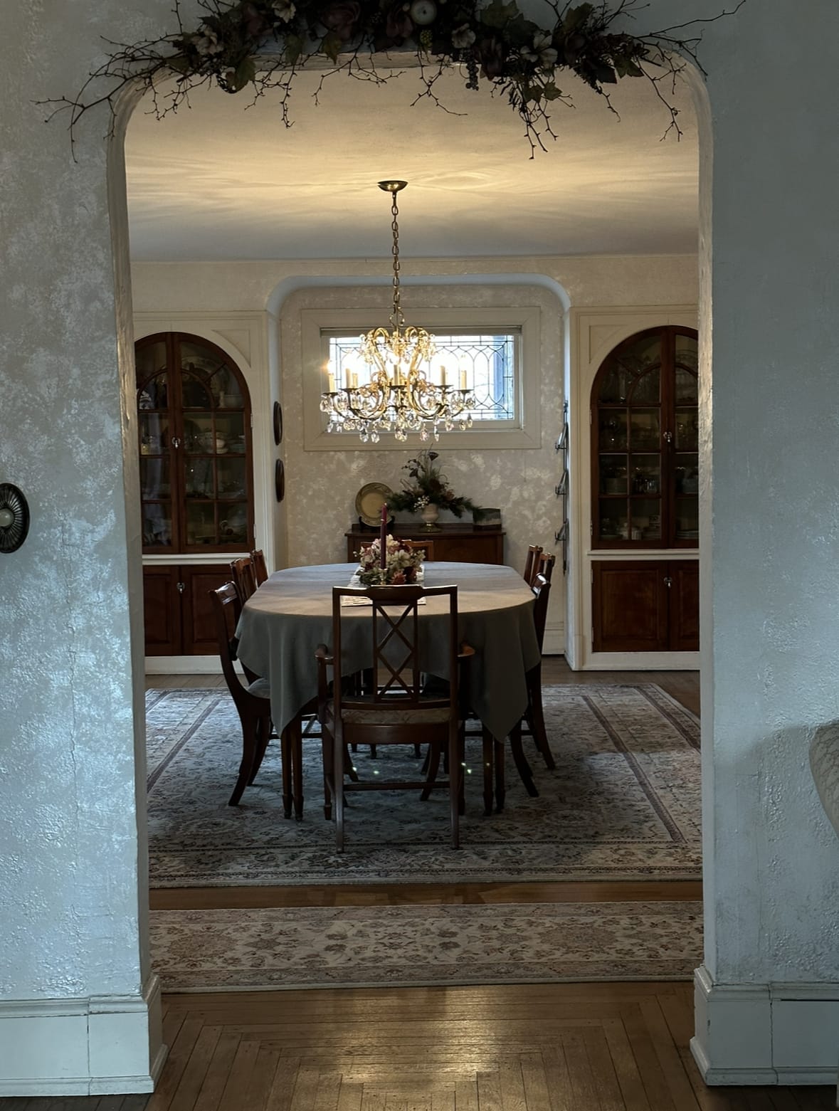
When we first saw the house, this was some photos just about a year ago during our inspection. The homeowner had such a sweet style and so many vintage pieces! We knew though that this space to make it truly function for our home and modern living we had to take this once stunning formal dining room and make it the kitchen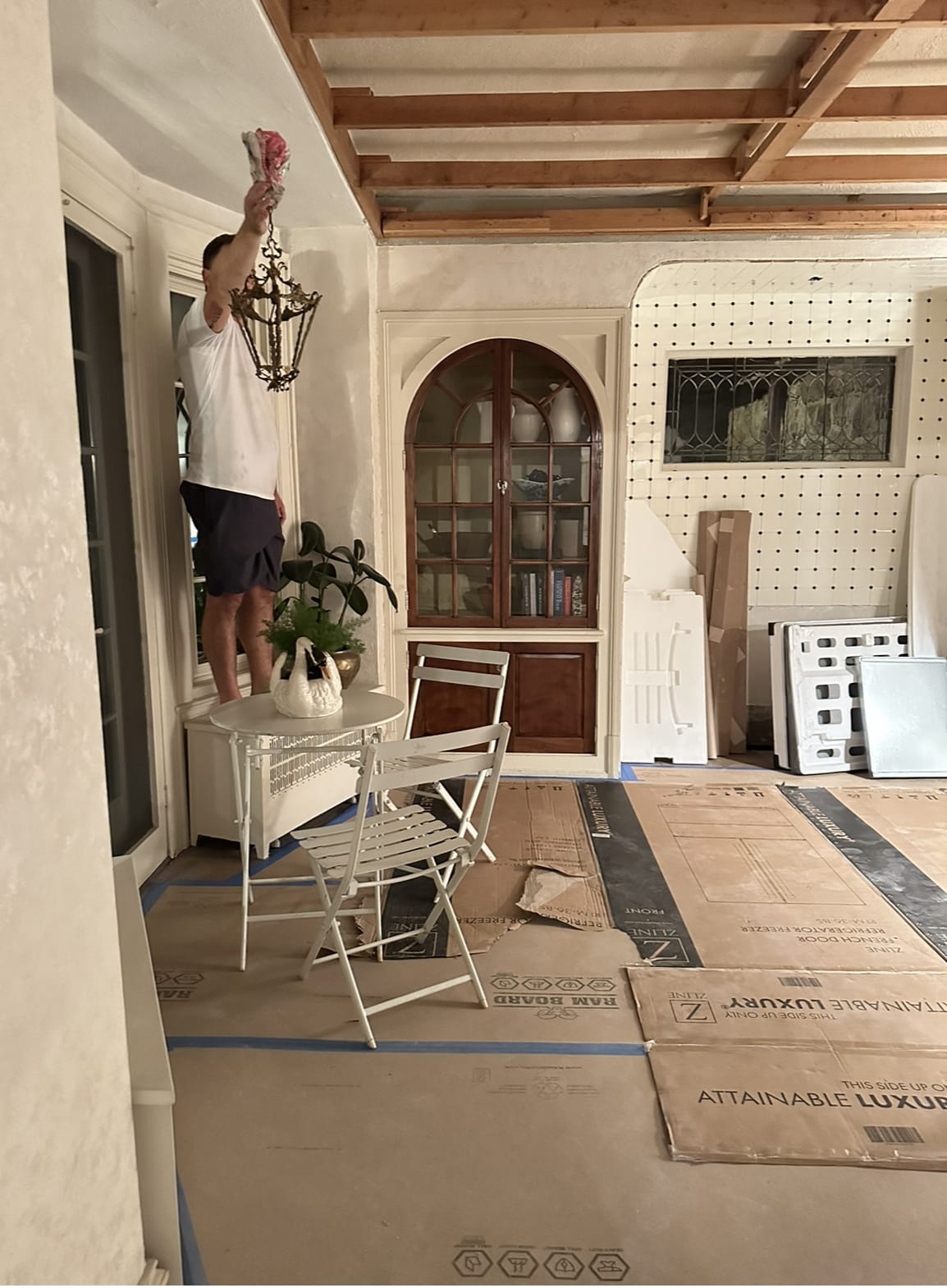
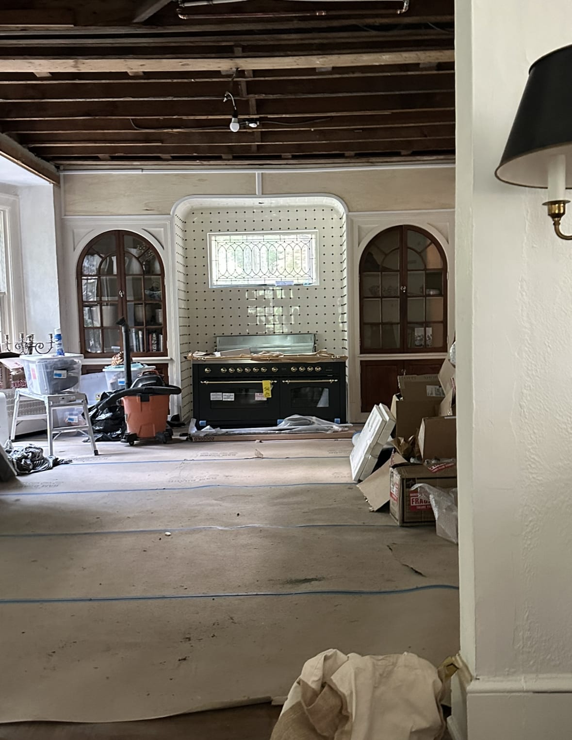
This space went through a lot….to get it to how it looks today. Including taking down the ceiling because of a supply line leak…that then lead to us finding a plumbing part for the toilet that was unnecessary and why the ceiling was dropped in the first place…so we then chose to raise the ceiling back up that truly made a world of a difference. But…we lived like this for almost 2 months!
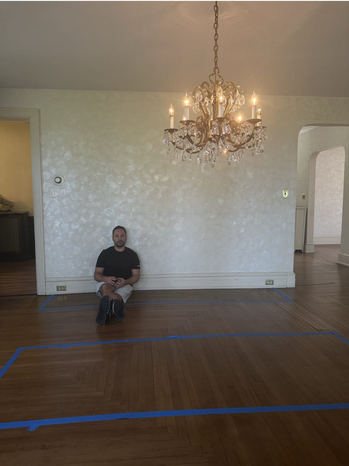
And one last pic from the week we bought the house, you can see the mapping out of cabinetry for our island and lower cabinets.
Okay…and now to the pretty pictures!
We ordered our cabinets through Omega Cabinets, I highly recommend them. We had them in our last house and I am an Omega girl for life! Their quality is mazing and I love that they have options that can truly bring your kitchen to the next level. When designing your future kitchen consider the details.
- Inset cabinets will immediately make your furniture feel more custom
- We decided to not to a toe kick to create a more furniture feel its a great option or even to do a custom toe kick that looks like furniture.
- Drawer styles and cabinet styles..did you know they don’t all have to be the same. I love having our cabinets feel like furniture so we chose smaller drawers for the top (for things like silverware or a sink drawer) and larger on the bottom for plates and storage.
- Cabinets that have pull out drawers-a huge help for those lowers!
- Design an island that feels like furniture with open shelves and mini junk drawers.
- beaded detail around your drawers and cabinets that make them stand out more.
- consider a custom paneled side or as we did faux drawers.
- hidden paneled front dishwasher
- and storage that truly makes cooking and living in your kitchen more functional.
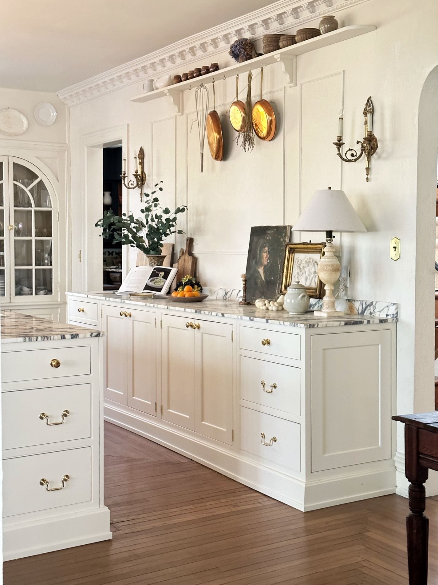
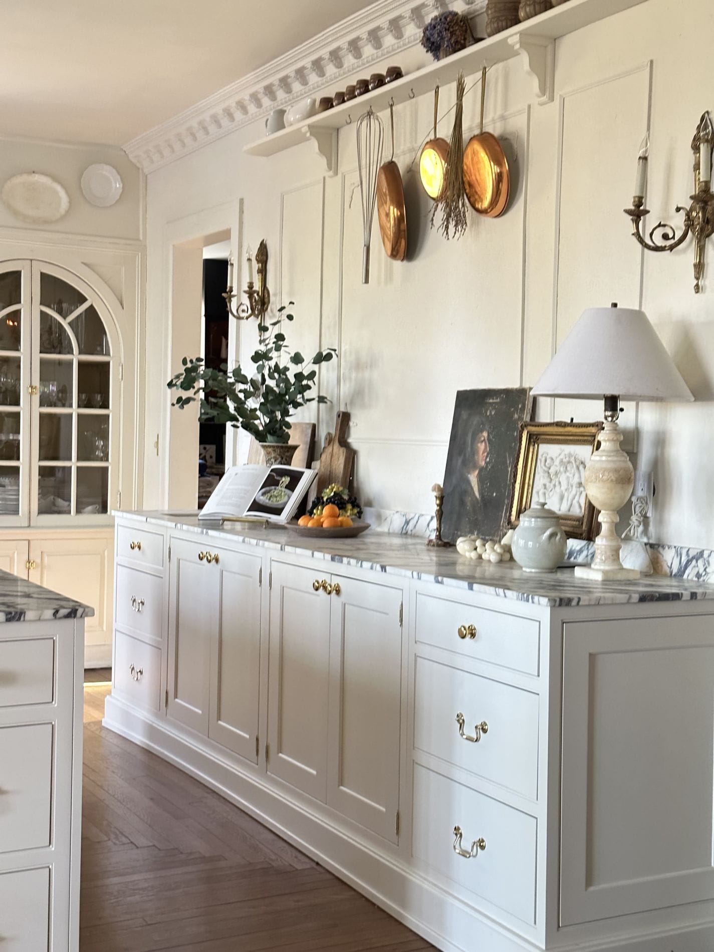
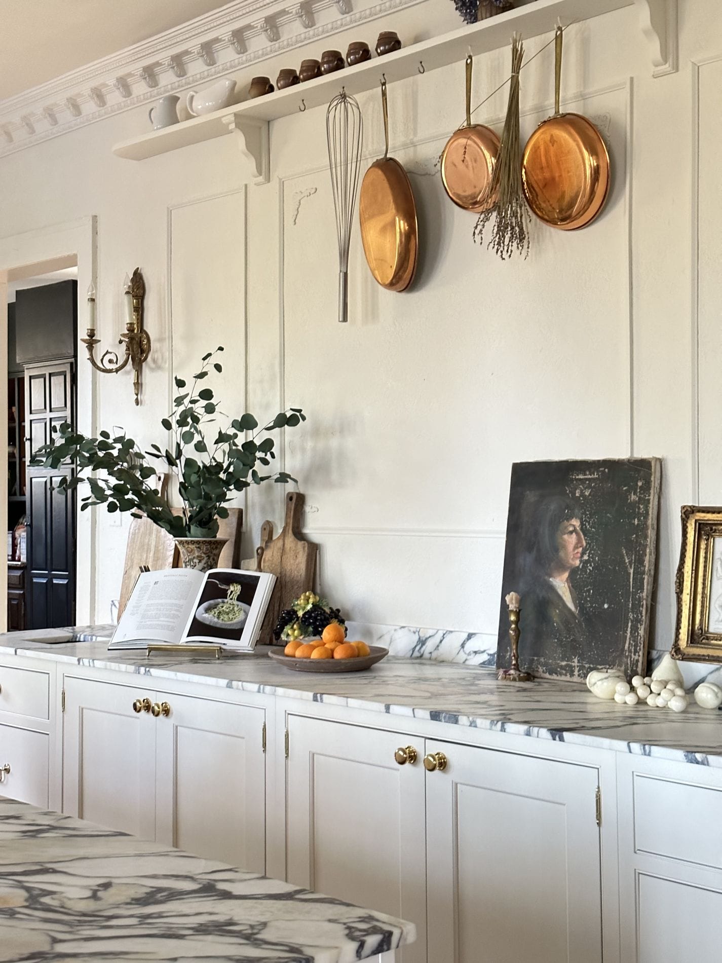
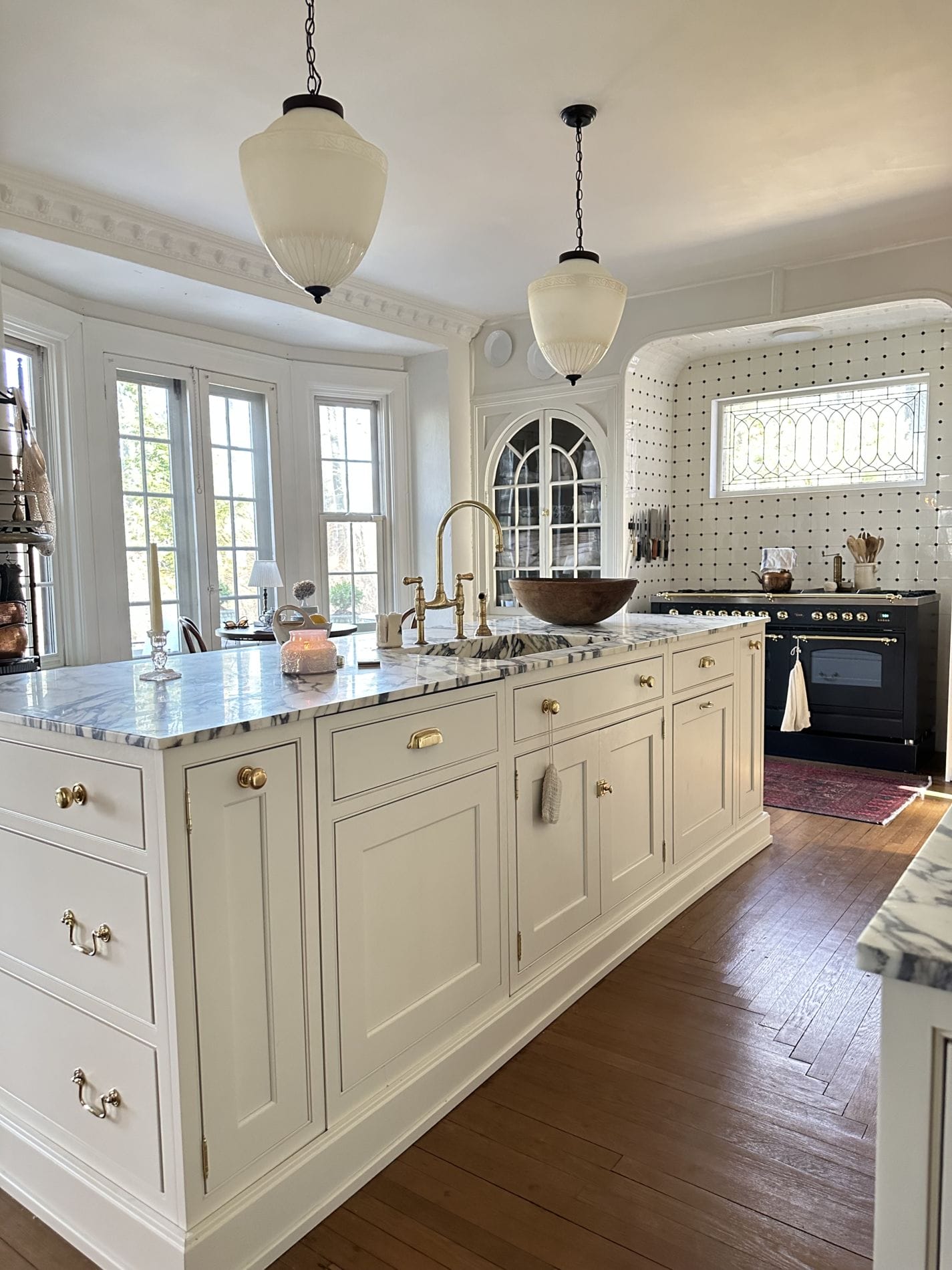
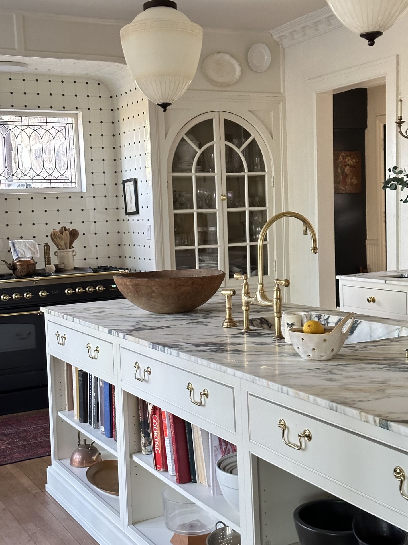
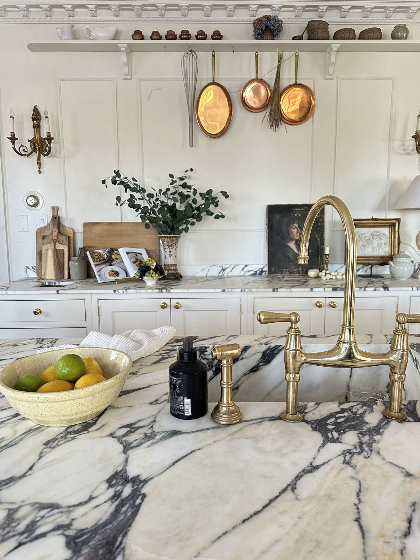
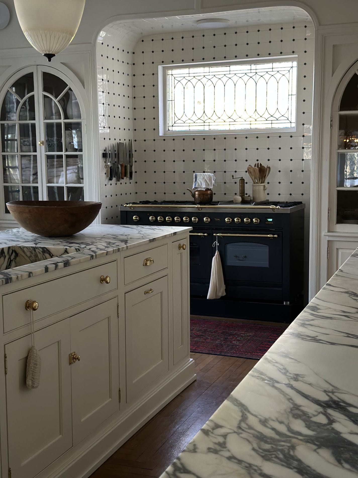

We are so excited for this kitchen space, its my favorite room to spend time in. I love the old world French kitchen feel mixed with some modern touches. The flow of the kitchen has made it so great to cook in, especially with the kids and hubby. We can all fit around the island and range.
Source List:
Wall color: Off White Behr
Cabinets: Omega through Masterbrand Cabinets
Cabinet Color: French Canvas BM (my favorite color ever!)
Counters: Monet-Viola Marble
Hardware: Antique Hardware
Faucet: It’s double the price on most websites, snag it while you can!
GET THE LOOK



What a gorgeous space! I love your style! Thanks for sharing!
Hi! This is one of the most beautiful kitchens I’ve ever seen! Congrats on all the hard work.
Thank you so much Regina I so appreciate that.
Hi Deb.
I love the look & feel o the kitchen. You have wonderful taste. My only concern is the lack of toe kicks in your cabinetry which will mean having to bend over & stretch your arms out more to do food prep at the counters. Body mechanics are very important especially as you age, & you may find yourself getting more fatigued especially when entertaing for a criwd
Oh gosh totally not a concern, so many people that don’t have a toe kick agree its not necessary.
Love that you kept the character of the home and added your own amazing design, it looks so warm and inviting. I love the painted cabinets on either side of your gorgeous stove, and the old painting leaning up against the wall with the copper pots hanging down is just perfect. Also, your lights over the island are stunning and the kitchen marble anchors everything in the room, so beautifully done✨✨✨
Thank you so much Deborah
I LOVE this kitchen!!! What a wonderful space. Incredibly beautiful. What a joy to work within.
Hey Deb!
Your are genius ,you have grate artist mind. Fantastic work! I can sense your happiness with the outcome, and I absolutely adore it. I really love this kitchen.
I agree. This is one of the most beautiful kitchens I have seen. The whites are creamy and warm; the decorative touches are lovely and warm, and really complete the look. What a great change from the stark white kitchens that have been popular for so long. This would be my dream kitchen.