A few months ago I shared about our Kitchen plans for the Mountain Chateau. What inspired me most were unfit kitchens from French working kitchens with that classic victorian touch. I really wanted the look of a kitchen that felt less like a “kitchen-kitchen” and more of space that was both minimal and tasteful. I think kitchens have been the most exciting makeover for so many homeowners and designers this last decade. With the kitchen being the heart of the home the design elements of kitchen design have come a long way. I scroll instagram and see one beautiful kitchen after the next. First was the classic white and black kitchen of the farmhouse era to now English design and exaggerated marbles being a “MUST” for a well designed kitchen. We left the world of white kitchens and opted for moodier and warmer tones. Blue, green, black, and griege cabinets being at the top of the trend list in cabinet colors. The romantic hues of burgundy and deep reds have started taking off lately as well, and of course the classic but now very trendy prep island design.
When it comes to kitchens I am always a fan of any classic from a Nancy Meyers movie to something completely unexpected. I like simple lines and neutral tones usually, and of course real stone counters! Our last Kitchen I poured my heart into…I adored that space so much and it was certainly hard to say goodbye to. So the excitement of a new kitchen of course was at the top of my list for The Mountain Chateau, but I wanted to do things a bit different this time around. I am thankful for the partnership with Omega Cabinets as I continue trusting their brand for again another amazing kitchen space. They have been easy to work with allowing me the time to get my thoughts and design right, switching gears when I could, offering many options for customization, and being the ultimate piece to the puzzle of this kitchen space.
I have more to share in a future post once our cabinets are installed, but I shared last week on instagram that my kitchen plans changed a bit since the last time I shared about them and now that the order is placed I want to share what I have planned for this kitchen makeover and a little bit of my overthinking thought process.
#1 I want classic
#2 I want a kitchen that doesn’t look like anyone else’s
#3 I want to be true to the design of this home
#4 I want it to be warm but bright
#5 I want the architecture pieces of this home to shine
#6 Prep space to museum…yes I’d like my kitchen to look like both
#7 I want it to feel like maybe it was always here
#8 unfit but pulled together
Okay that was the original thoughts…and then I tossed around color and island. My goal for the space was that it would seem vintage and so when we designed the island I really wanted the island to feel like a vintage piece of furniture. I looked at every wood finish from their line and really loved the natural walnut feel since it felt most like furniture. I designed a spot for a vintage cookbook collection, a ton of storage and a place for our sink, garbage, and dishwasher. I really wanted symmetry with everything too. One of the issues I had though was really having our wood appear aged…I kept thinking vintage would solve that issue but I need the functions of a true kitchen. I looked at wayyy too many kitchen designs and most of the wood kitchens I saw they felt too “wood” like. Nothing wrong with them and the wood quality Omega had was really beautiful and rich…but I couldn’t live with the thought that it would not actually be what I wanted. Then I thought am I crazy to want an all white kitchen in a world of colored kitchens?
The current state of our kitchen, tiles (niche) is done, range is in…but a lot more to go!
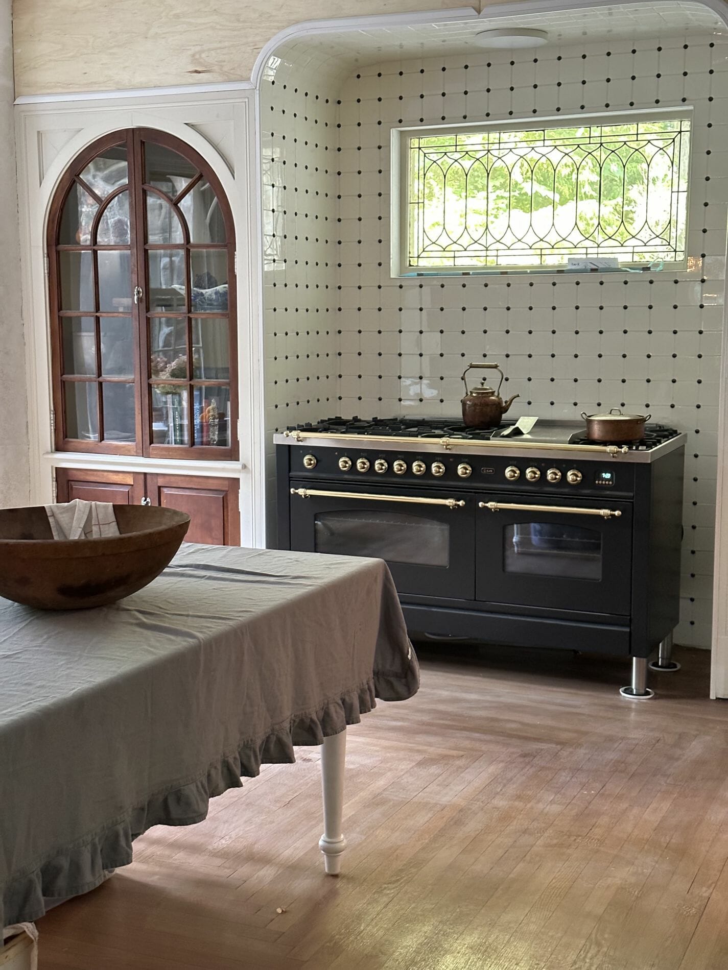
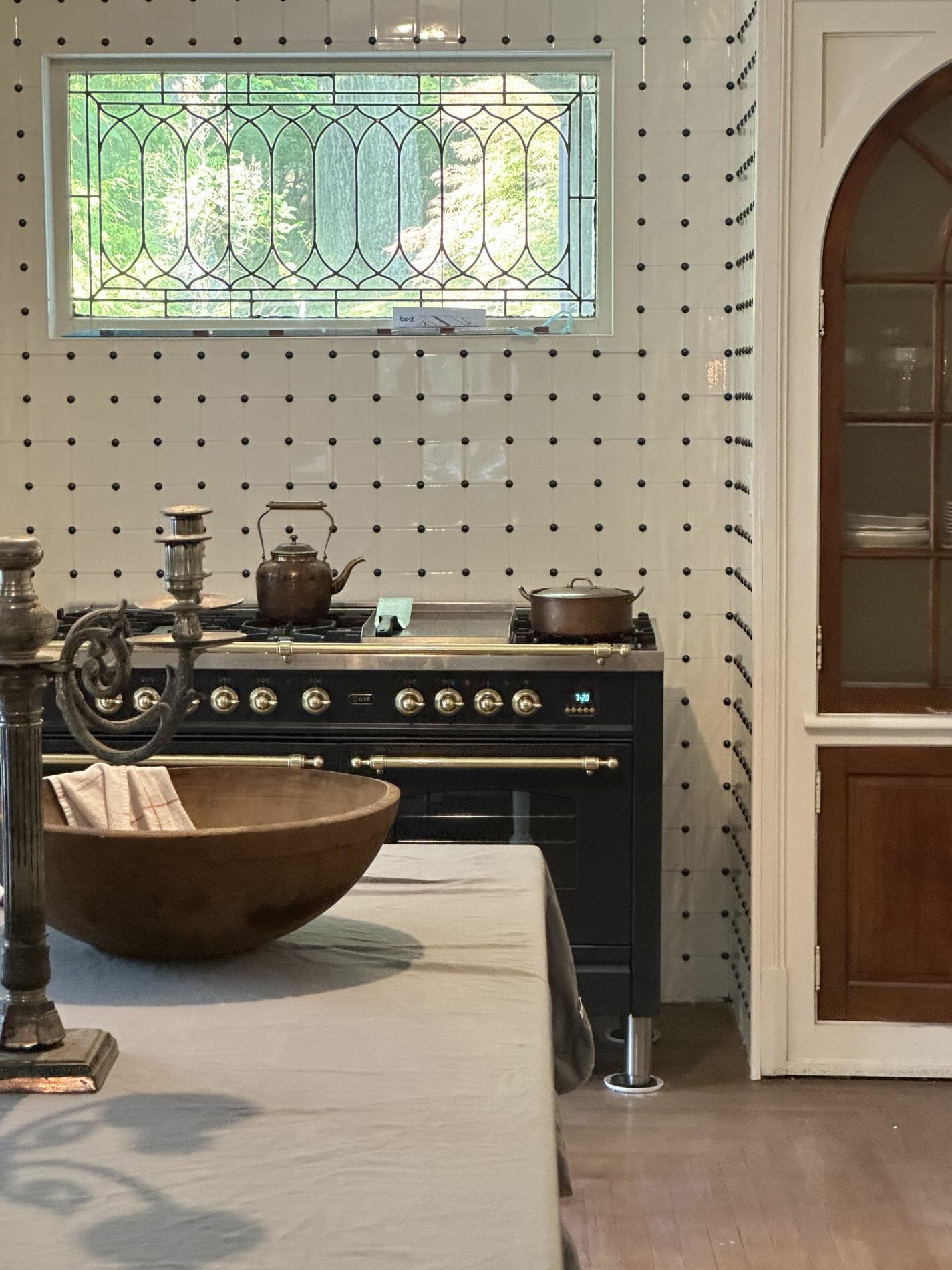
After all this crazy talk…I decided to just order an all white kitchen…yes you heard me right the girl that preached white kitchens were out just a few short years ago is designing a white kitchen. I decided it felt most classic and if there was a challenge for me it would be to make the most non-boring white kitchen ever! How to create interest and character to a space that is keeping with classic elements like white cabinetry.
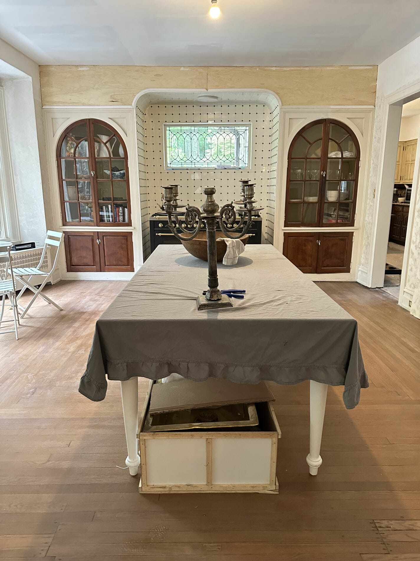
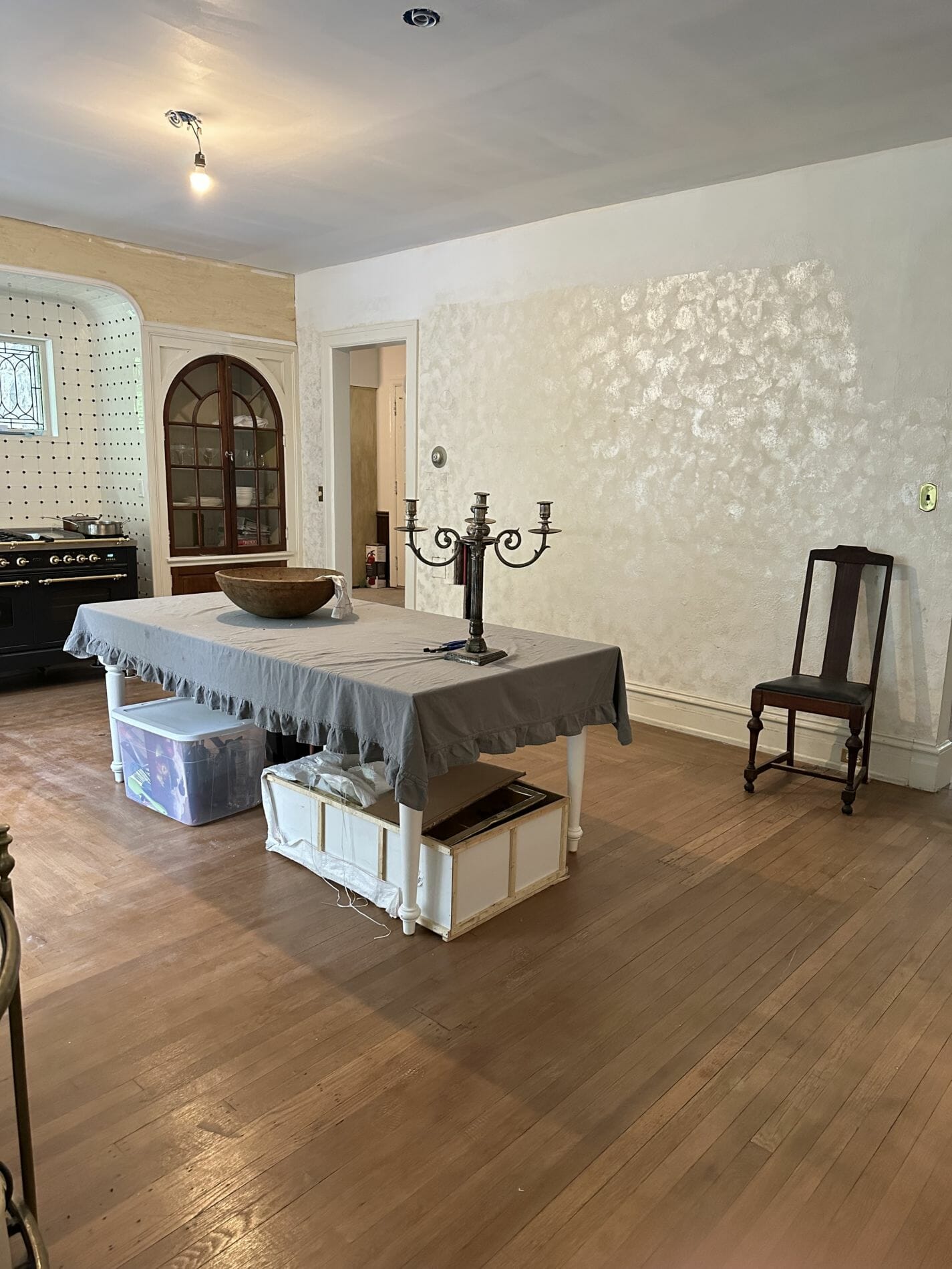
I have a ton of thoughts on how to pull this off with the architecture, the already amazing niche with the white tiles and black nail heads (classic victorian feel), crown molding, bold marble choices, lime wash walls, and vintage!
Here’s our kitchen plans:
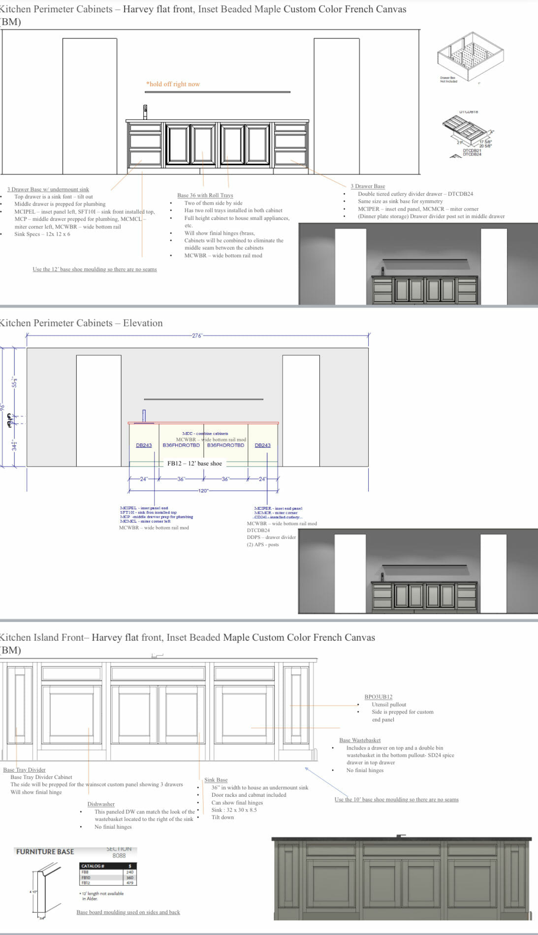
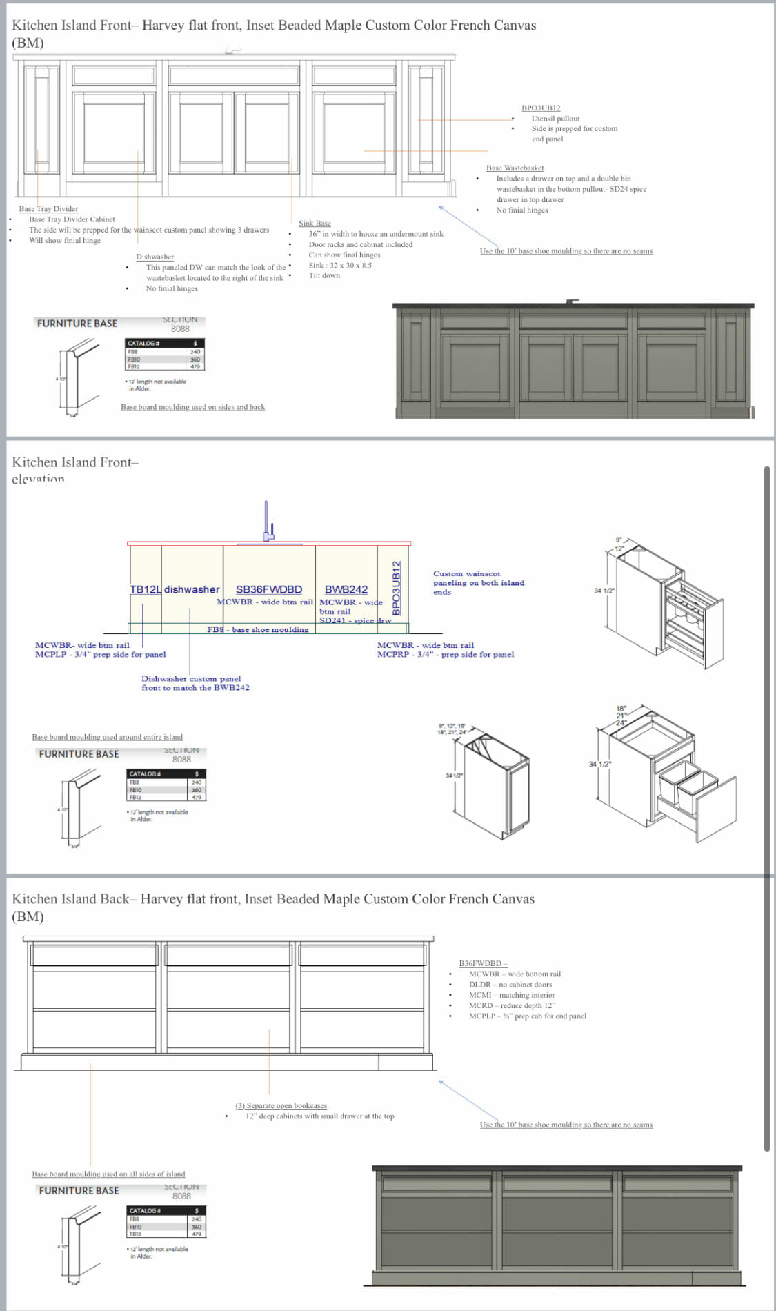
And here are some of the items we ordered to make a white kitchen not seem so boring:
- crown molding
- paint (haven’t decided on a color yet)
- Kitchen range
- sinks (not sure about the upkeep and overall quality until we use this)
- prep sink
- faucet
A few other decisions left is what color to paint the built in cabinets, the wall color, and. some vintage accessories like a runner, pendants, and sconces.

Sounds amazing. Can’t wait to see the progress. I designed my kitchen about 13 years ago. It was stressful but I still love it.