I have been doing a little daydreaming here lately. I truly love getting lost in a new project idea and think of all the special touches that could bring a new space together. I’ve been sharing a bit about our Shed interior makeover that I have been working on. Its been a storage shed up until now and well, we need it for function and to have another creative space. So the European She-shed design plans have been surfacing.
This post contains affiliate links that I make a small commission from with no added cost to your purchase.
Since adding our little ducks to our family I have been thinking of ways to make feeding and giving them water easier. So a Garden shed idea I thought would be the best way, but we imagine using it for so much more too. Think creative space, possible workshops, a new area to advertise for our photoshoots we have at our house, and I imagine some lovely fall nights hanging here…maybe projector and sofa?!
We have a lot to think of and still decide besides having a great sink area, but in time it can evolve and maybe even change as our lives change.
I started thinking about how I envisioned the space and truly I think all the European vibes and tons of texture, but also a relaxed space that still feels like a shed conversion. I don’t want dry wall and to cover it all up. Maybe if it was a pole barn it would be different, but I still feel having the shed bones are important for the true character of the space and to still keep with all the shed vibes, but cute!
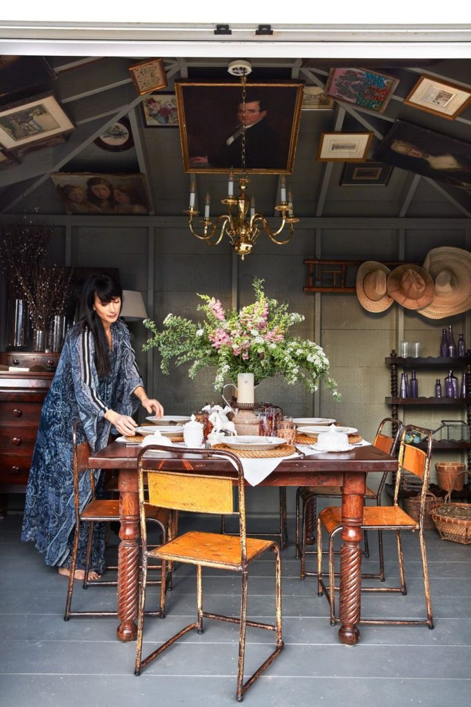
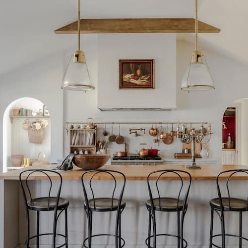
The main inspiration came from this photo that I had found and it made me realized how much I desired a moody she-shed rather then a bright and airy one or even a wooden one which was kind of what I thought originally.
What I love most about this is the idea of adding vintage furniture, the vintage artwork, and using the space for formal and casual setting.
Here’s some design boards I put together to achieve a moody European she-shed. I would love to know what’s your favorite and what details you definitely think we should have. Just envision all the spaces having terracotta pots lined on a shelf, vintage art hung on the walls, moody paneled she-shed walls, and a marble table with a bust centerpiece.
DESIGN #1
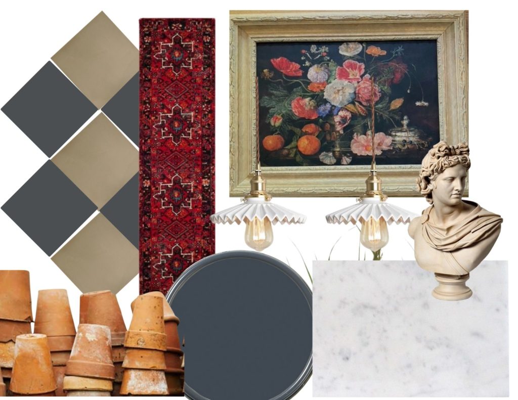
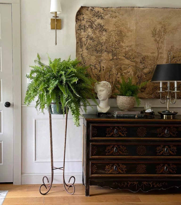
This one above was my first idea, I wanted to do a gray-blue color since the red runner I have, has touches of blue in it. It’s the perfect moody color but with a touch of color, I def know I don’t want to do black in here.
Source: Tiles, Lights, Paint: Cheating Heart BM
DESIGN #2
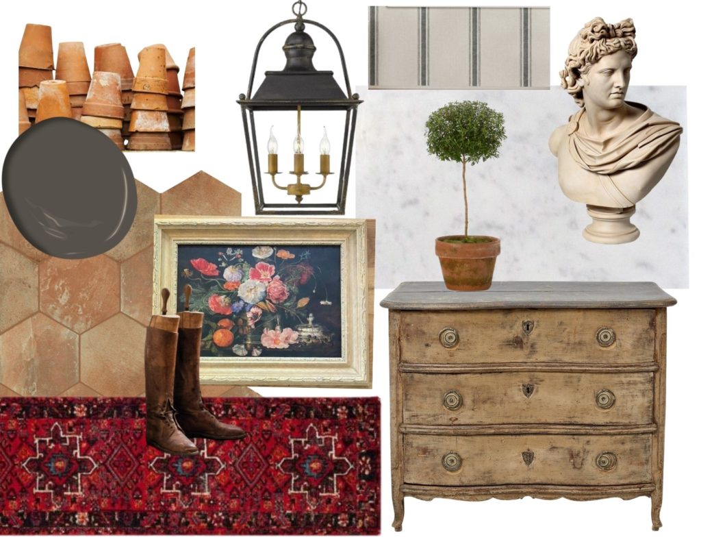
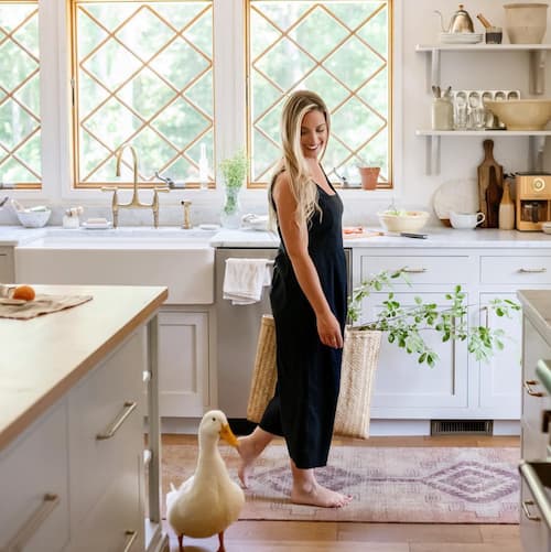
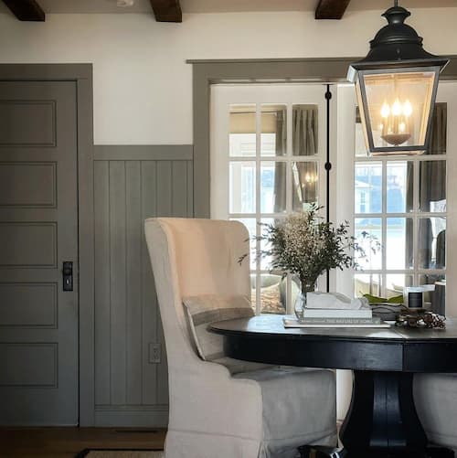
I love the idea of a terracotta tile too! It’s something I desired in our house when we were building and renovating, but I was a little afraid to go that bold with a warm colored tile and glad I didn’t, our hardwood floors are warm enough and it probably would feel to flat with them, but the shed could be the PERFECT SPOT, and the ones I found here were a great price. Pairing that with a moody warm paint color and I think maybe lantern style to give more of an indoor outdoor feel would be so fabulous. I think a touch of grain sack would be so classic French style, torn between wallpaper or curtain, but that simple stripe will be so good.
Source: Tiles, Light Fixture, Paint: Dragon’s Breath BM
DESIGN #2B
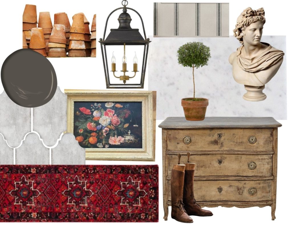
DESIGN #3

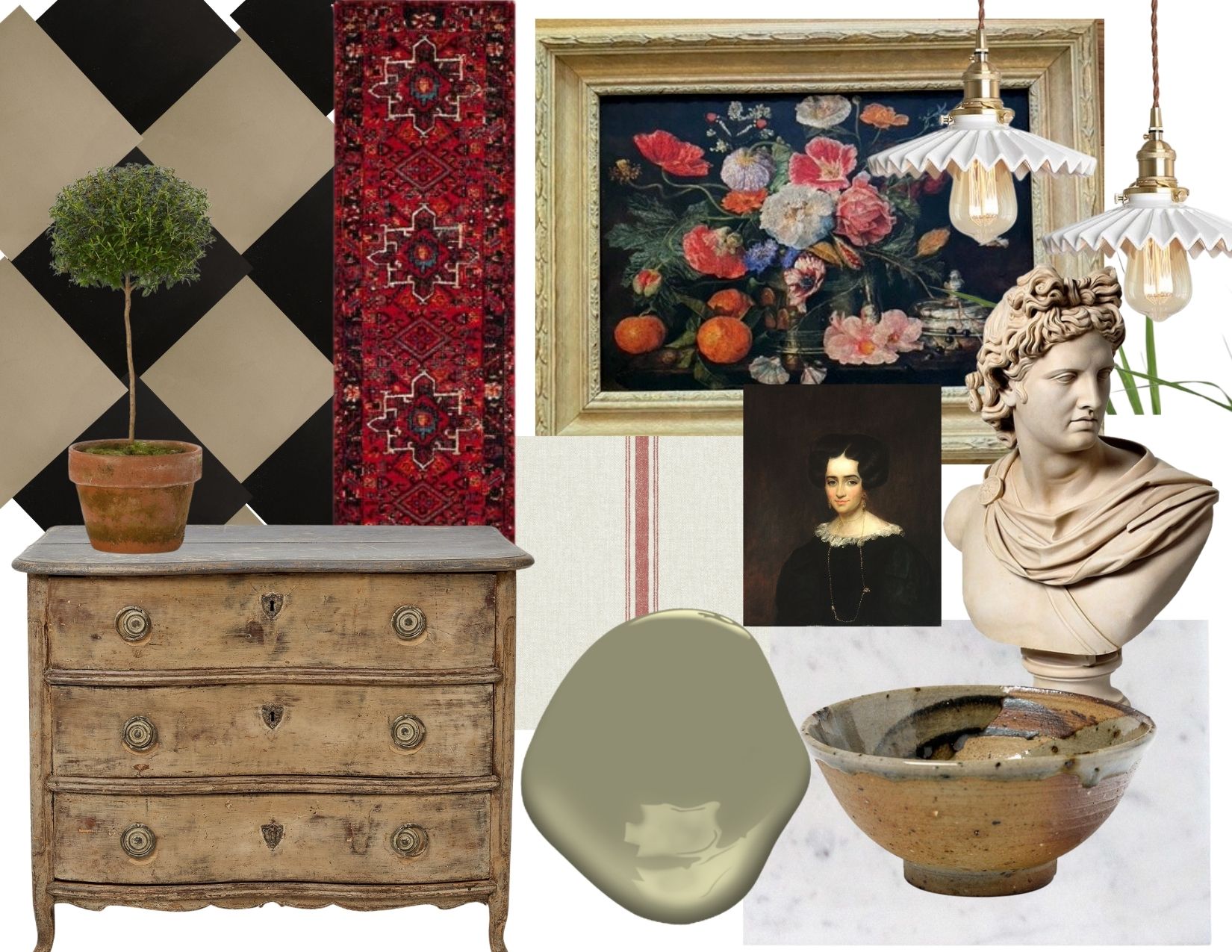
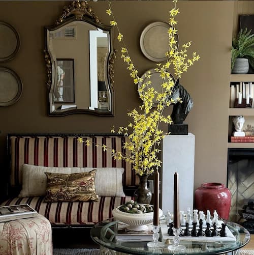
The most unexpected one was this design, I just love the idea of beige and black cement tiles either in a diamond or check styled. With a moody green paint color, and touches of red! I know I’m not a red girl, but that red grain sack with the red runner just feels like they just work! My favorite color combination in the whole world is brown and black so it would be the perfect room to see that vision come together.
Source: Floors, Runner, Paint color: Wethersfield moss BM
The idea of a cement like floor or limestone has also been a big contender too. I think it will all fall based on the flooring and maybe a little combination of them each. I’d love to know if you have a favorite design? paint color? or floor. The accessories can change, but those are the most important pieces to seeing this vision come together.


16 Responses
I love all your boards but I think I’m really drawn to the last one – there’s something about the black and white and green!! It’s just gorgeous!!!
Although I prefer the lighter feel of the green paint in the last mood board I think your style is most closely matched with the second mood board. The question to ask is how lunch light appearance vs dark do you want?
They are all good options, but I really like the tile floors on #2. 🙂
I think some of your decision should be based on how much natural light you get in your shed. It would be really cool to do a moody paint color If you don’t get a ton a natural light, then I would do the moody green paint, bit I think that would be moody and earthy if you did the green paint with the terracotta flooring. All of your ideas are amazing and beautiful. Can you share some of your sources for the other accessories like your topiary? I am struggling to find a realistic looking faux topiary. Thanks for sharing your beautiful ideas!
Actually love all of them…especially design #2!
Luv #3
I love all your options. I also know come each spring and summer I would want light and airy. So how can you have moody and light and airy without repainting and changing out decor. ????. Think about air and heat without insulation too.
Love them all! But design #3 is amazing! Can’t wait to see what you do. Following you with much envy ????
I LOVE ALL THE DESIGNS BUT MY FAVE IS #3 !!! I love the green paint!!
How wonderful each one looks! I choose #3 it is beautiful. Your talents will shine through on any
Design you choose. I can’t wait to see the finished product.
I like #3 too. It looks as if it was all coming together at that point. Look forward to seeing the final product.
How fun for you!! They ste all beautiful, but I’ve always been partial to a black checkered floor…..and that dresser, along with the green paint! ???? Whichever you pick you can’t go wrong!
Loving design 3! What a fun project! Enjoy!
Love them all but,
2B is my choice.
All the design boards are fabulous, however my favourite is the last except with terra-cotta pots and use the black stripe grain sack for a skirt under the counter. I love the black/beige diamond patterned tile, red rug, dark lantern fixtures. The vintage table and rustic metal chairs in the inspiration photo is perfection! Love the dresser you show in the design boards. I am excited to see you work on this shed transformation!
I love your #2 vision board, but I like the light fixture from #1 and the red stripe sack from the last one. I just feel if your vision is to do some potting in there then the flooring from #2 just makes more sense to me. Maybe because I feel it would mask any dirt on the floor. Regardless any of these would be lovely.