Can I just say how excited I am that I am taking part in the One Room Challenge. I have been wanting to take part in this challenge for some time. It is just really hard, since usually we don’t work on one room at a time. We get a project or two done then move on to another room or project. Most of the rooms in my house at this point are just about half way done. I think the only room I can count on being “done” for now is the Family Room. Other than that, each room still has finishing touches or a (new) “to-do” list in the back of my mind (shh..don’t tell the hubby he doesn’t know this).
Anyhow this kitchen room challenge kind of just snuck up on us and happened. I mean we weren’t planning really to do major updates to this room until my parents began to do a new kitchen reno (which I will share eventually) and let us take their old cabinets off their hands. For the most part the cabinets were the same as our original cabinets. Same yucky oak color and 1980’s-90’s style. The shape was slightly different considering our insert had a little arched to them…but since they would be on the opposite side of the kitchen you would never notice.
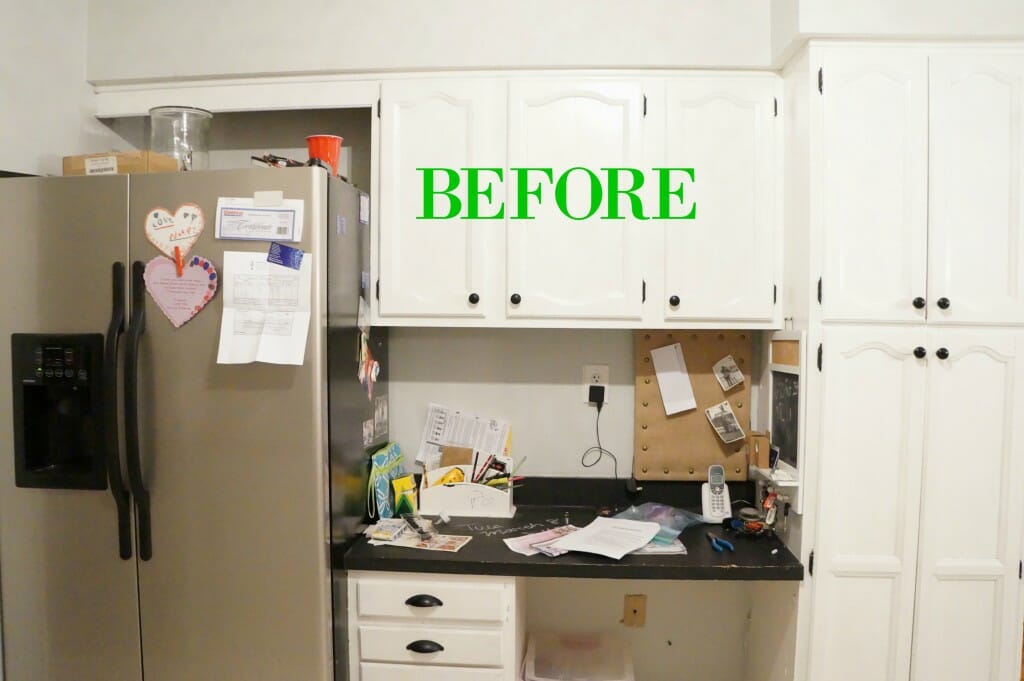
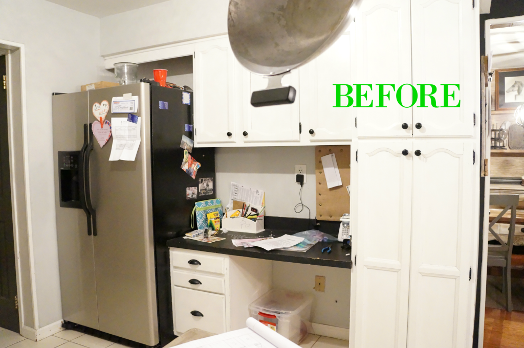
I rarely showed this side of our kitchen considering I really disliked it. It had that 1980’s desk still in it, and our refrigerator was shoved all the way to the corner which did not allow us to open the freezer all the way. Just picture every Costco and BJ’s trip ending with us shoving frozen boxes into a small opened doorway. Frustration and maybe some curse words in there.
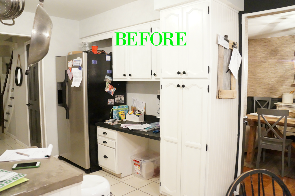
So here is what the kitchen looked like before the demo! (don’t mind the mess)
Though the cabinets look good, the space just never worked. This desk always became a throw zone, and the bulky pantry hid more natural light in this space.
See how that fridge is squeezed up against that wall? and the desk never had a chair or use for this space. No chance in prep work over there.
Though the cabinets look pretty, the inside of them were always a wreck. The shelves were falling apart, and there was absolutely no organization going on in here.
So with the new cabinets we figured out a plan how to make the cabinets fit in the space without looking like we threw the cabinets in here.
Now of course, we couldn’t just stop here with the cabinets. Once those cabinets came down…mama’s brain started rollin’ with tons of ideas! So this project took on a multi week project that brought out our slightly farmhouse style kitchen to a “real” farmhouse style kitchen. Well…almost real! So I am excited about the changes. I feel the kitchen is now bigger then ever, chippier, glamorous, and for sure a nod to french rustic that I love. And before I end it here…this makeover will also include a great giveaway at the end for you all to start up your farmhouse touches at home.
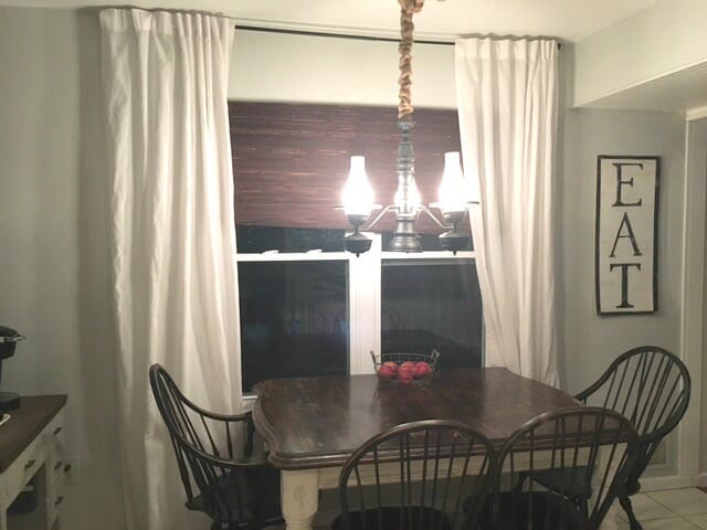
Just a little before on this side of the room as well:
I apologize for the poor image quality. These were taken all at night and I snapped them quick. So this wall, had it all wrong. Too large of a table, the chairs were starting to get warn, the curtains had ovaltine stains all over, and the gray-ish blue wall color was just too dull with the (still awful) flooring. Not to mention my DIY light fixture had to go! Though the fixture was pretty cool, I wanted something more Modern Farmhouse and less 1980’s farmhouse.
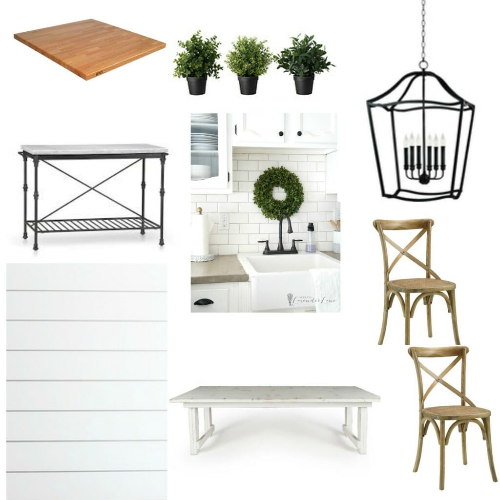
So now that you all got that…lets just share a design inspiration board so you’re all on track with where this kitchen is headed. Some things may change from now until the completion of the project, but for the most part this is the inspiration behind my Farmhouse-French-Rustic-Kitchen.
1. Some Butcher Blocker Counters 2. Marble top coffee nook 3. some ship lap walls
4. White chippy (narrow) kitchen table 5. Wood Bistro Chairs
6. Oversized Lantern Pendant (lampsplus) 7. Some greenery (faux)
Along with, tons of painting, new accessories, and maybe some marble (ahh did I just say marble!) This girl got her marble and it may be my favorite part.
So stop on by every Wednesday as I will be sharing new projects and updates of his One Room Challenge.
I’d also like to thank those companies that have helped sponsor this post series:
The Napsak (etsy shop)
Bows and Burlaps Designs (etsy shop)
and to see mine and other ORC posts click here!


It looks like your kitchen is going to be beautiful like the rest of your house. I have butcher block counter tops and I really like them.
Thanks Sherry! I only did a touch of butcher block counter, which I love to break up the space. It’s the perfect way to add farmhouse charm.
Can’t wait to see the makeover. Love your insiration board.
Marty Oravetz recently posted…Spring On The Porch
Thank you Marty!
Looking forward to following along with this, Deb. I know it will be amazing!
Roxanne recently posted…Kitchen Makeover Before-One Room Challenge-Week 1
Thanks Roxanne!
Love this space already, Deb! I can’t even imagine how amazing it’s going to be with the updates you have planned! I’m loving your inspiration for the space. I’m excited to follow along!
Thank you Sarah! I am happy to have you following along!
Very exciting!! So glad to see that you’re participating too! This will be a beautiful transformation. Love your design plans 🙂
Thank you Lindi! I’m so excited to be participating this time around.
Deb this is going to be amazing. Love the light but especially interested in how your design will complement the rest of the space and dining area. I love your take on farmhouse and your chalkboard wall is one of my favs.
Stephanie @ Casa Watkins recently posted…One Room Challenge Dining Room Makeover: Week 1
Thanks Steph! You are too sweet!
Love your inspiration board Deb!!! Nothing like farmhouse style! Excited to follow along… this’ll be so fun!
Thank you Kendra! I’m so happy to have you, following along!
Definitely just pinned this inspiration board for later 🙂 I’ve been searching my home for a place to add some amazing marble as well! Love! This room is going to look so different and I can’t wait to see how it turns out!
Thanks Jodie! Yes, I’ve been so anxious for marble, I’m so happy to get me a little ; )
I love your plans for your kitchen. Looking forward to following your progress.
Thanks lady! I’m so happy that you stopped by, can’t wait to share!
Beautiful inspiration, Deb! Can’t wait to see how you transform the space.
Thank you Amy! I am excited to share all the changes!
I love farmhouse kitchens! Cannot wait to see how everything comes together. Good luck!
Erin @ Lemons, Lavender, & Laundry recently posted…One Room Challenge: Are You Ready for Some Football?
Thank you Erin!