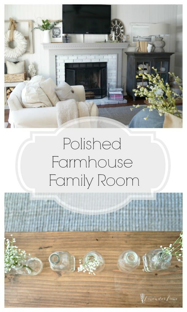
Neutral Farmhouse Family Room update on a budget. Just a few changes to give the room a refreshing look for the New Year.
Happy Snowday! how about that snow, east coast people? did you all get a lot? I think we hit that 2 feet mark maybe slightly more. Been shoveling and playing outside with the kids all weekend…and of course the dog! How much snow did you all get? Well, if you’re snowed in…I’ve got the perfect little reveal for you all of my refresh of my Neutral Farmhouse Family Room.
I am so stoked and so excited to be sharing our “new” room with you all. You will recognize a lot of similarities from the before, but the after feels more polished and slightly more farmhouse style that I love.
First, I have to say a big thank you to Stephanie from Casa Watkins for arranging this challenge and rounding up some amazing brands that were so wonderful to work with. Lamps plus, Minted, Framework, and RugsUSA were generous to work with us. That being said this is a sponsored post, but I can not rave enough how amazing their products are and how 100% satisfied and happy I am to be sharing their products and brands with you all today.
The first week here I shared some of the plans for the room.
The second week I revealed our white wash brick makeover.
Today you’ll get to see all of it come together.
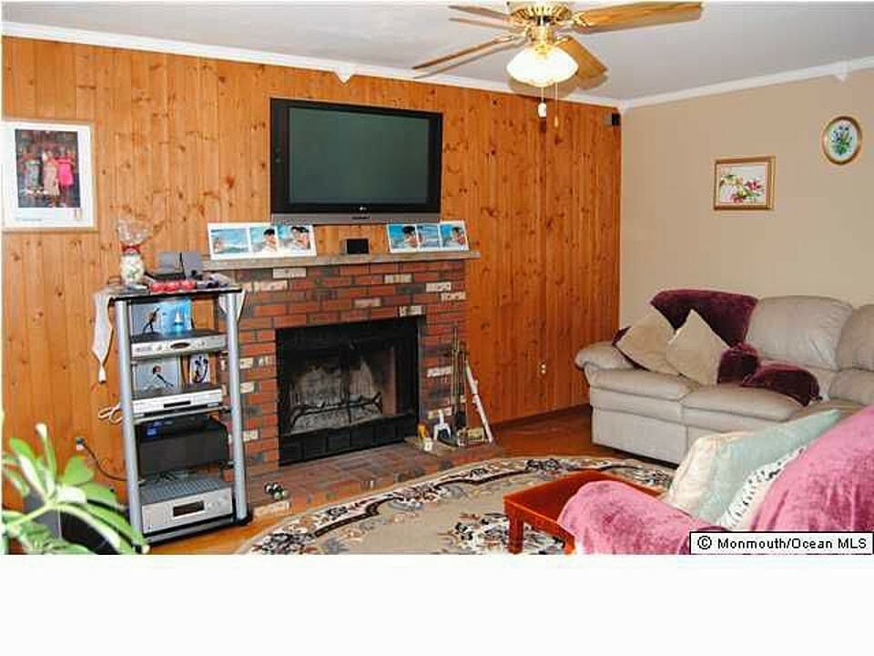
I want to share once more a BEFORE photos of how this room look prior to us moving in.
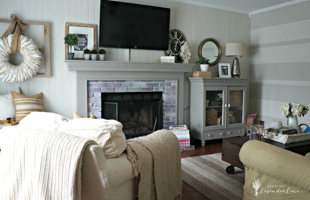
Then we made over the room. The below photo is what the room looked like prior to the new changes. A lot of DIY, paint, and affordable furniture options.
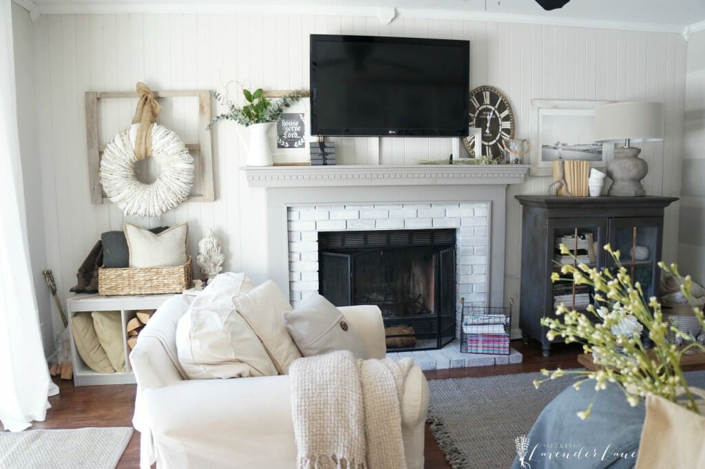
And now…
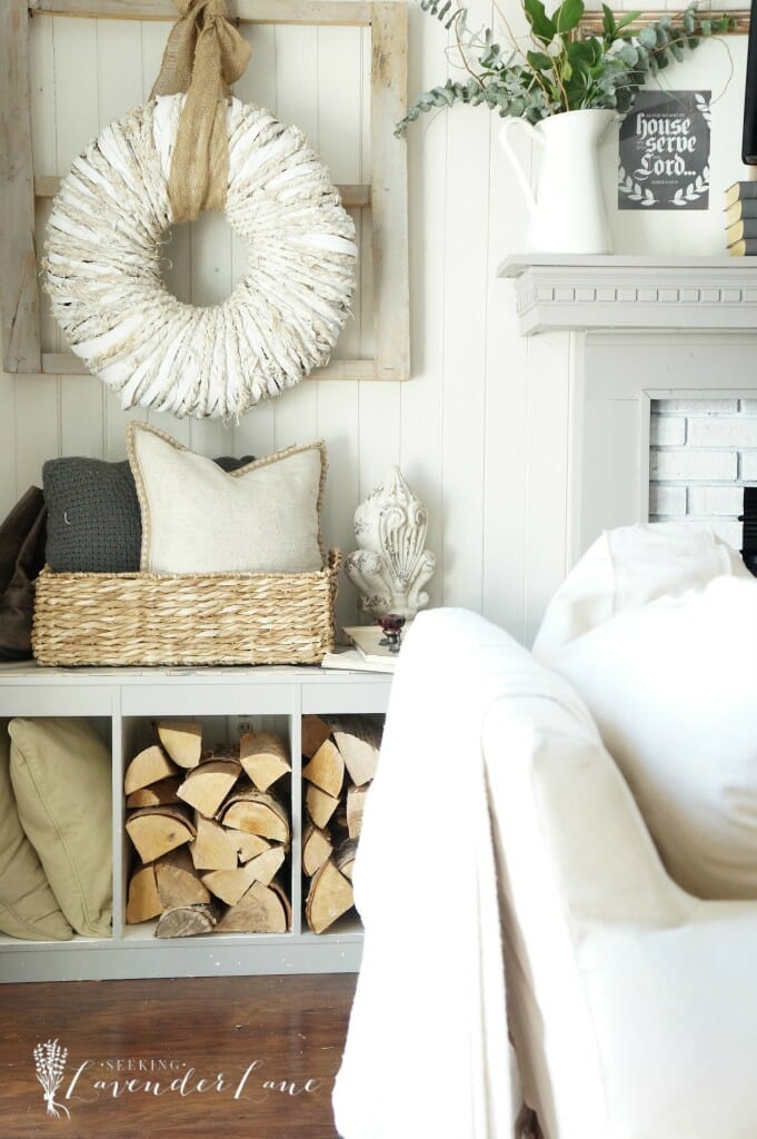
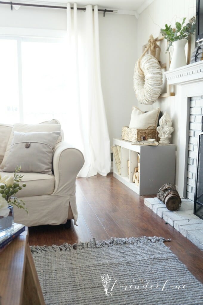
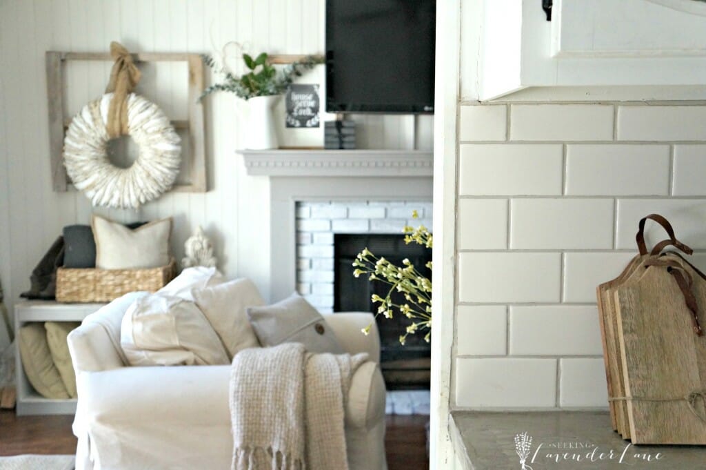
So the color stayed the same and so did our left side of the room. I had to keep that wreath of mine and the log holder works out perfectly for now. I would like to eventually switch that out and hopefully put a beautiful antique bench (but that’s in the plans for another time).
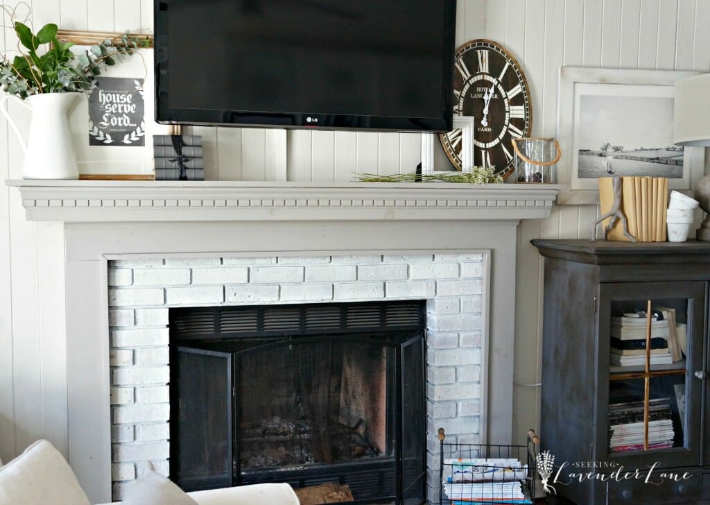
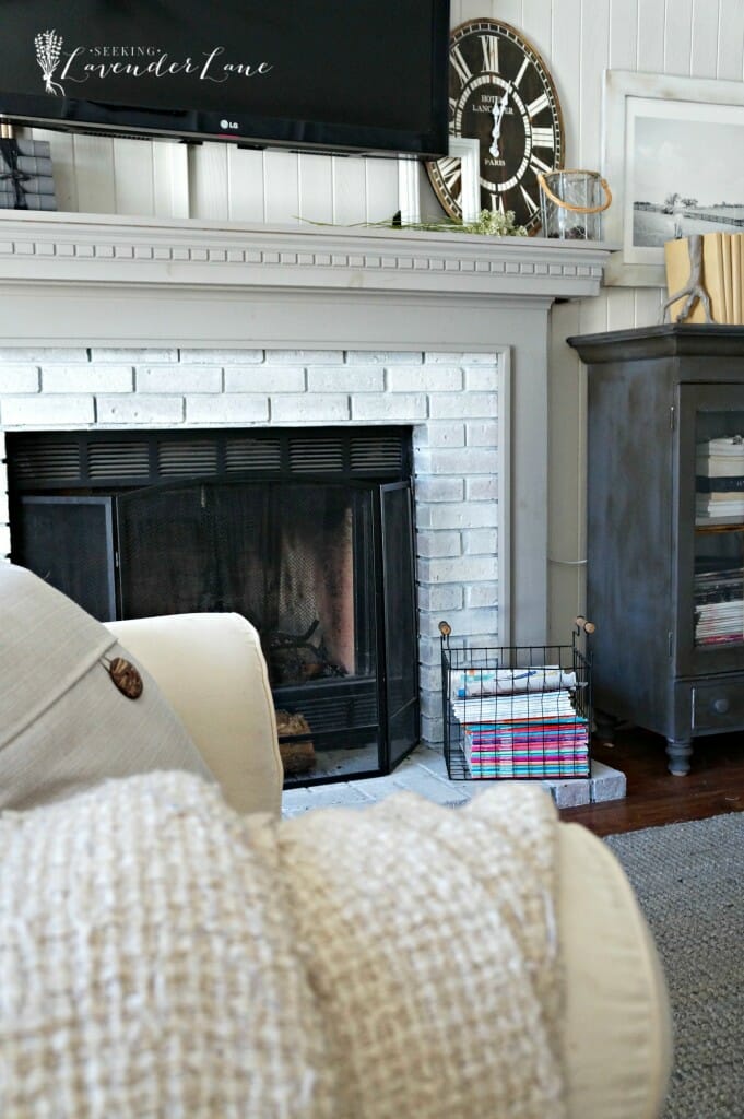
As you remember from last week we re-whitewashed the bricks and they look and work much better in this space now.
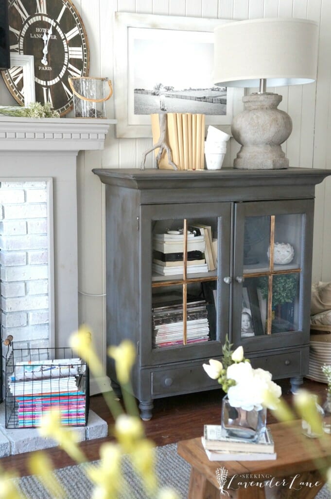
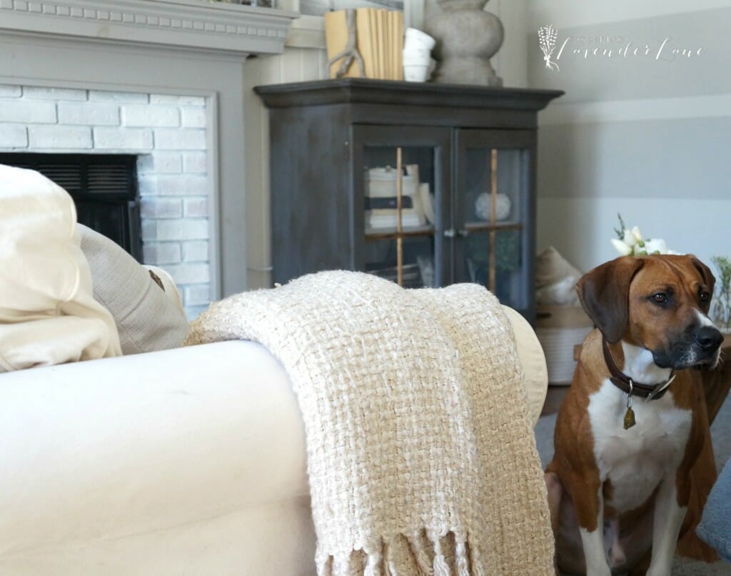
Notice this beautiful dark and dramatic cabinet? I know I originally mentioned having your help on choosing the color…
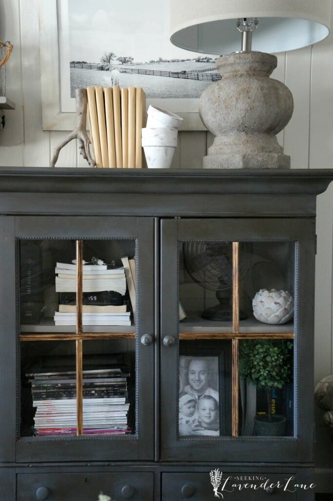
Well, I thought really hard about this and then got a little afraid with time. So I decided to go dark and bold! This color is Graphite by Benjamin Moore. After painting the cabinet I went into panic mode that the color was not suiting the room. I felt it had too much blue undertone and then not sure if the dark and dramatic was a good choice. Anyhow I decided to work with it a bit and came up with this design. I’ll be sharing more on that next week.
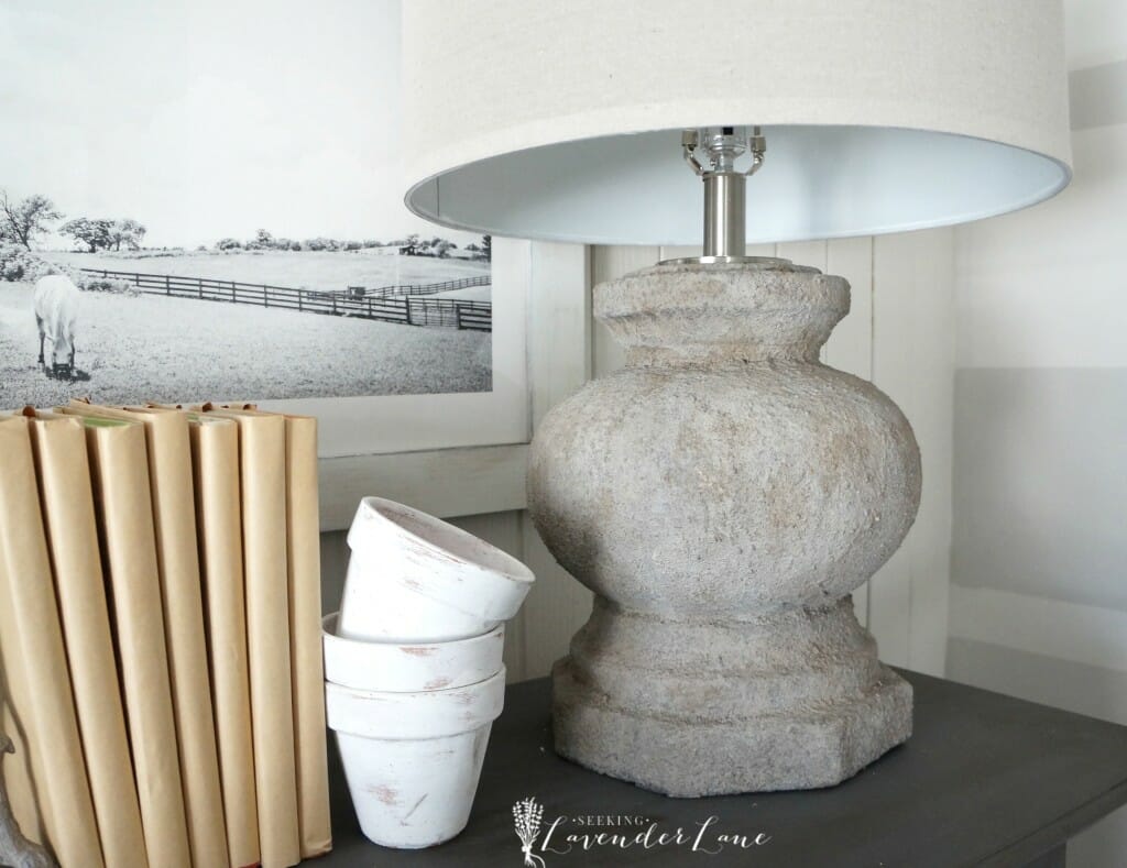
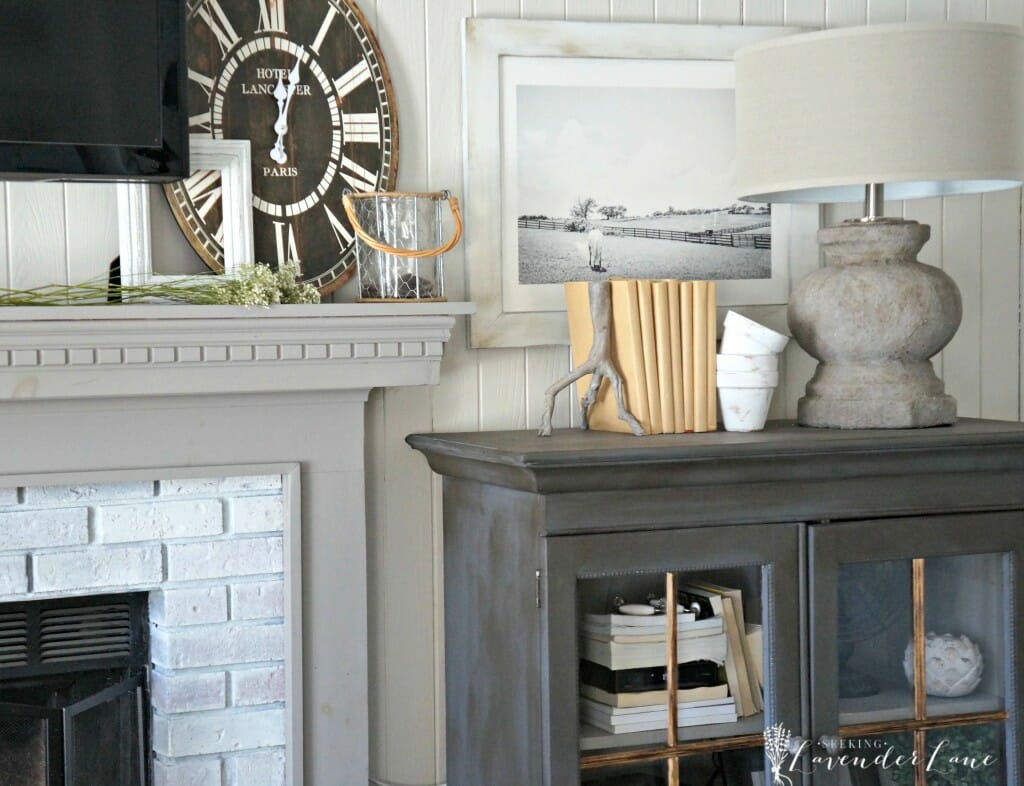
Most importantly in this corner of the room are the changes I made with the lamp and this gorgeous photograph and frame. I really needed something more dramatic and stunning here then the lamp that I had…and something that touched on more of the farmhouse look. This was a gorgeous find at Lampsplus! I squealed a whole lot taking this one out of the box.
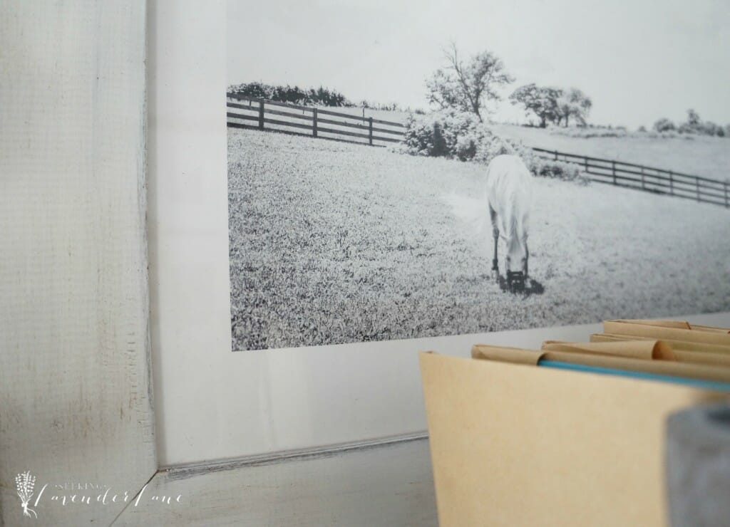
This photography and frame is from Minted. They not only made beautiful Christmas cards for me to send out this past Christmas, but also offer stunning home decor options. This photograph was the perfect nod to the farmhouse feel. I especially loved taking out the mirror that was here. It felt less proportionate in the space and I think I was getting a little overboard on the “circular” shapes that were on this wall starting from the wreath-clock-and mirror. This really finished this corner the way it needed to be finished. After receiving the print though the frame felt slightly white in color then I had thought. The one hard part about ordering products online. Fortunately I had a little dark wax that gave the white frame the warmth it needed to suit this wall.
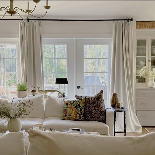
Notice something else new on this wall? The white curtains! Loved adding this here! It completely changed the room and made it feel brighter and taller. I added the curtains to the tippy-top of the wall to create that drama. The last ones I had in here were much shorter and though they matched well, the white and bright just feels better.
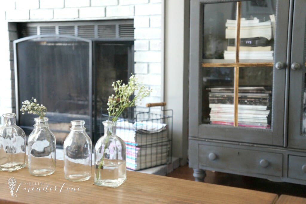
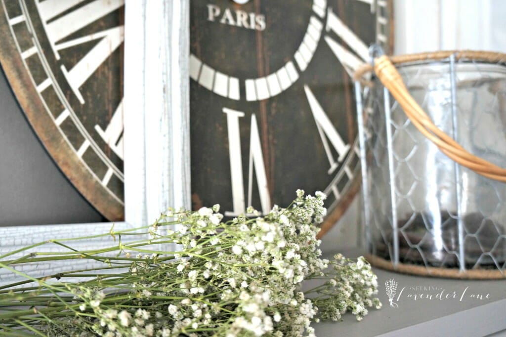
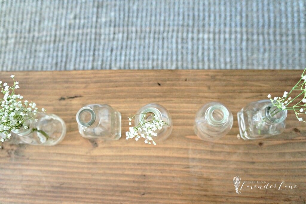
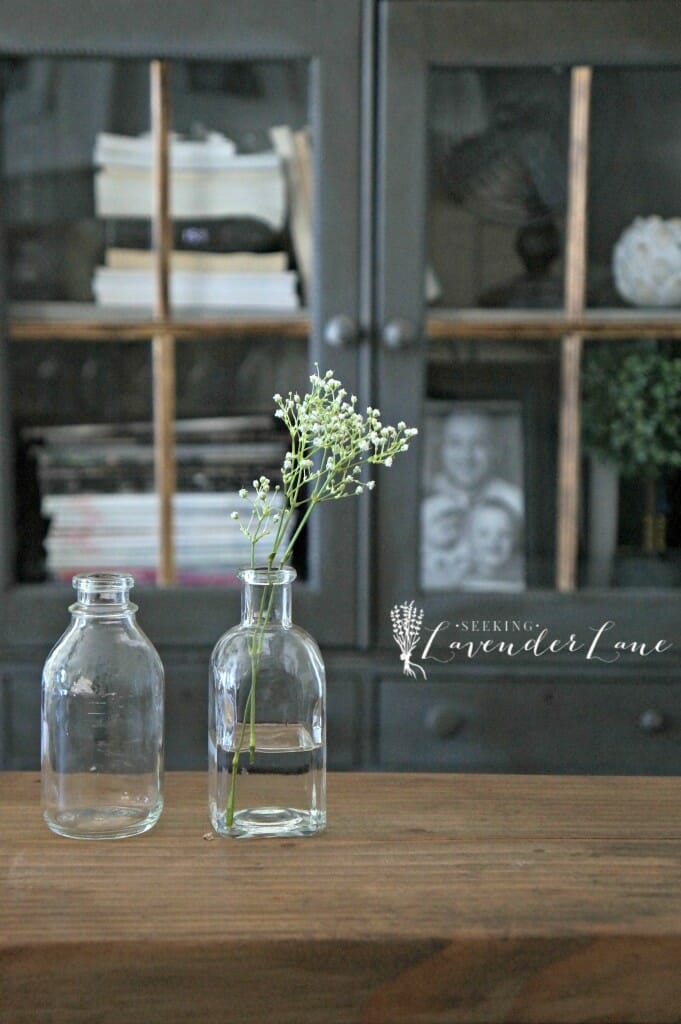
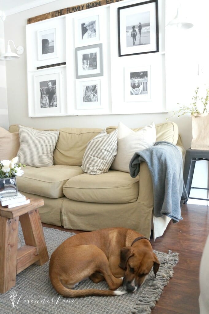
We temporarily added my dining room bench in here as a coffee table since due to the snowstorm this weekend I have yet to receive the new coffee table that Lampsplus is sending my way. Of course I will update you all on that next week (for our last New Year New Room Challenge post). Although I am totally loving the look of the bench coffee table style in here, especially with these adorable glass jars I picked up with a touch of baby’s breath added to them.
Look at this ham he had to be in the way while I was taking these photos.
Notice my new DIY pillow cases? That’s another blog post in the future here. The ticking stripe suites my taste perfectly since it declares vintage farmhouse all the way!
Last, but certainly not least…that gorgeous rug Mr. Luca is napping on. It is my favorite piece to this entire room. Though I really liked the previous rug, this one definitely has a polished, luxrious touch and a stunning-stunning look to it. It for sure brought the colors in the room together too and I love the solid color and natural fabric about it. My favorite part of the rug is how it has a fringe finish.
Source List:
Horse Photo: Minted.com
Lamp: Lamps Plus
Rug: RugsUSA
Clock: Antique Farmhouse
White Pitcher: IKEA
Wreath: Homegoods
Logs: Birch logs (mine are from stop and shop)
Colors:
Walls: Pale Oak
Mantel: Winters Gate
Cabinet: Graphite
Stripes: London Fog
Get the Look

PLEASE STAY A WHILE





43 Responses
It looks great! I’m going to show my husband the before and after…maybe I can convince him to let me whitewash the brick fireplace in our living room!
aw yay! I hope he agrees…whitewash is amazing!
Wonderful!!!! It’s gorgeous Deb. So much brighter with the lighter brick each and the new carpet is wonderful
Stephanie @ Casa Watkins recently posted…Get The Global Look: Styling A Family Room Desk
Thanks Steph!
I would say the new room only looks. . . about a million times better! WOW! Totally love it!!
Thank you so much Sara! I feel like I really had a chance this time to pick pieces that compliment each other since I did the remake all at once. My rooms always take time to piece together since it’s always a financial issue…but having the chance to pick pieces that compliment each other that works made this a more put together room.
oh wow Deb, you have some great elements in your space. I really like how the cabinet turned out. I think the darker tone balances out the room nicely and that lamp….GORGEOUS! I cannot wait to see your table from LampsPlus.
Thanks Jess! I was a little worried about the cabinet at first, but now I love it!
You have the prettiest family room! So polished and pretty and bright! I love everything. If I made myself pinpoint one thing it’d be those pretty glass bottles.
Thanks Corinna! Isn’t it funny how that happens the smallest piece makes the biggest difference! I’m loving those myself! I feel like I need to buy baby’s breath though every few weeks to keep them looking pretty ; )
It’s all gorgeous Deb and I’m looking forward to seeing the new coffee table. What a difference from when you moved in to now, after you put your magic touch to this room!
Thanks so much Marie!
Wow Deb, the updates you did made a huge transformation. The lamp you picked is AMAZING! The cabinet’s new paint is perfect! It’s a great contrast to the room. The art work is the perfect piece! I just love it ALL Deb!
Sara @ Shabby Grace Blog recently posted…A Modern, Bright & Fun Playroom Makeover
Thank you so much Sara!
It looks so fresh. I looking at photos and comparing past to current and how we evolve in our decorating. I’m going to have to go back and see if I have some long forgotten pictures of when we first move into our home. It will be fun
Mary recently posted…Recap of Thrifty to Nifty Home Decor in 2015
Thank you so much Mary!
I love the new look of your room. The first thing I noticed was the dark cabinet. It’s stunning and elegant. I also really like the baby’s breath in the jars. Very nice touch (I loved that detail when I saw it on instagram). Wonderful job!
Thanks so much Rebecca! : )
Loving the new elements. I adore the jute rug with the fringe. Such a casual but elegant choice. The art you chose from Minted is wonderful too–I have a thing for horses lately and this one is darling! Your whitewashing also made a huge difference. It looks so bright now! Perfectly refreshed!
Brittany @ white dog vintage recently posted…New Year, New Room Refresh Reveal!
Thanks so much Brittany! Yes, I;m with you on having at thing for horses. I can’t seem to stray away from them in my home. I thought this was a subtle way to add another horse without actually adding another huge horse painting.
The color that you chose for the cabinet looks great! Beautiful room.
Lora recently posted…Valentines Day Gift Guide
Thanks so much Lora! I’m so glad you love…I was a little worried about it, but I feel confident now it was the right color choice.
What a transformation!!!! LOVE the fresh and relaxed feel of your space! Great job!
Thank you so much Vel!
Small changes with such a big impact! Love the new lamp and art work, and you were spot-on lightening the fireplace while darkening the cabinet. It makes for the perfect contrast. I love the new rug, too–so much yummy texture! Well done, friend!
Sharon recently posted…New Year New Room Challenge–Mudroom Reveal
Thanks Sharon! Yes, I agree sometimes small changes is all you need for a major impact! : )
Oh Deb!! It is just beyond beautiful! I love your simple and elegant farmhouse-y touches. It looks so warm, inviting and cozy! Your mantle looks fabulous – extra fresh (and whiter 😉 ) Great job!! -Rachael
Rachael @ This is our Bliss recently posted…New Year, New Room Refresh Challenge | Master Bedroom Week 3: Sneak Peek + gorgeous gold table lamps
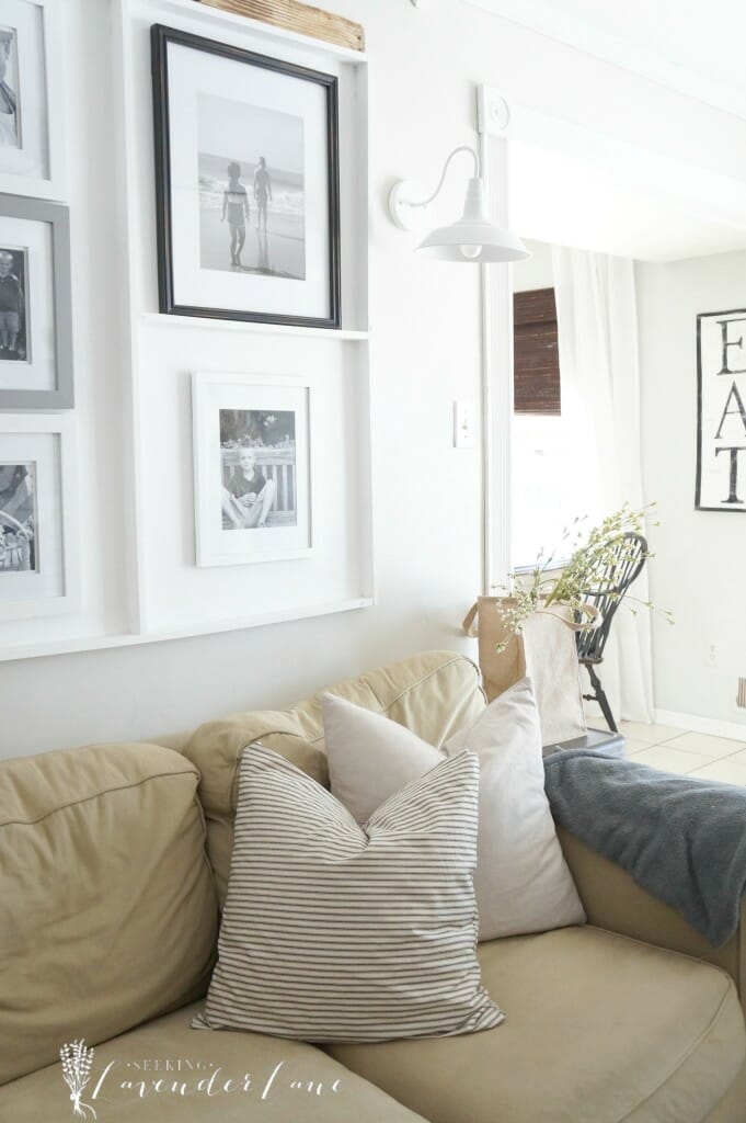
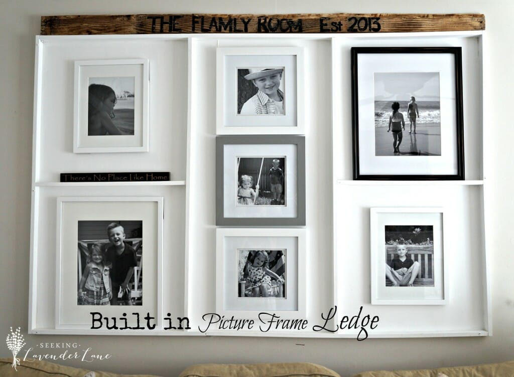
Some fantastic changes! The fireplace brick next to your dramatic cabinet is beautiful. I’ve never noticed the picture ledge over your couch before. It’s so cool!
Kathy recently posted…Create and Share: DIY Notebooks with GraphicStock
Beautiful! The whitewash makes the fireplace look so different. I’m also really liking the darker color on the cabinet. Wonderful changes!
Thank you Nikki!
This is absoltely GORGEOUS!! The power of paint can never be underestimated! I want to come and live with you! Beautiful and inviting and most of all calm! Great job Deb!!
Mary-the boondocks blog recently posted…A Basket for my Snugglies – Ένα Καλάθι για τα Χουζούρικα μου
ahhh thanks Mary you’re too sweet! That just made me smile : )
Love your room! Would you please share the paint color on the fireplace surround? Thanks!!
Hi Kassandra! Thank you so much…the paint color is Winters Gate by Benjamin Moore.
Visiting from the Scoop, and I love your room, Deb. It’s really well put together. Loving that rug (and Mr. Luca obviously does too!). We had 19″ here in the capital of WV, but I’m happy to say the very last of it melted yesterday! I’m dreaming of a green spring. 🙂
Thank you Rita! Yes, me too! It warmed up the last two days and it’s giving me that itch for spring : )
Did you have to use a special primer on the knotty pine? Would like to do the walls in my family room but afraid the knots will eventually show through the paint. Your room looks terrific!
Thanks so much Karen! NO we did not use a primer. We did two coats on this wall. We were fortunate especially since the color we chose is so light. I hope that helps and good luck!
That is an AWESOME makeover! I love how soft all the colors are and how the whole room says “come on in and stay awhile!”
It’s gorgeousness all around Deb! So bright and inviting. It’s hard to believe it’s the same room in that first picture!
Thank you so much Cristina! That means so much coming from you : )
Love your wreath..did you make it? I see the rope, is that also ribbon?
Hi Julia! Thank you so much, actually I bought it last year at Homegoods. It’s rope and and wicker. It’s so awesome, yet I haven’t seen it back there since I bought it.