Well, the journey has been fun, but I am excited to say we are DONE! The last 6 weeks certainly felt super long. I thought our Master bedroom would be done quicker, but with a few design hiccups, additional design decisions, and time restrictions, it took the entire 6 weeks. I want to break down our room for you all with all the products selected that truly made this a unique space that I was surprised how it came together.. I initially thought when building our house I would go more classic white on white but as the room evolved I took a left turn and made some bold and non-safe decisions. It was a fun room to design, make traditional yet modern…and have fun with! But…before we get ahead of ourselves, let me remind you what the room looked like BEFORE and share the links from each design week. Especially, if you are catching this at a later time. ORC Links

- Week 1: The Before and the design board
- Week 2: Painting Trim the Easy way
- Week 3: Frustration in the middle of a makeover
- Week 4: Faux Fireplace
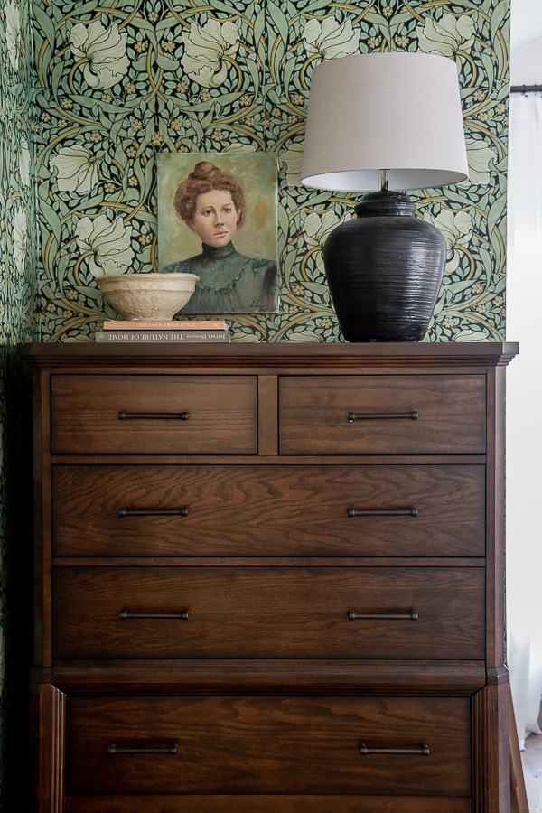
- Week 5: William Morris Removable Wallpaper from Spoonflower
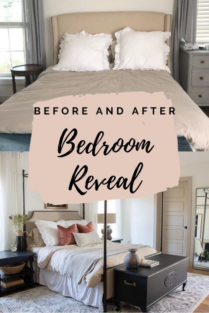
BEFORE picture:
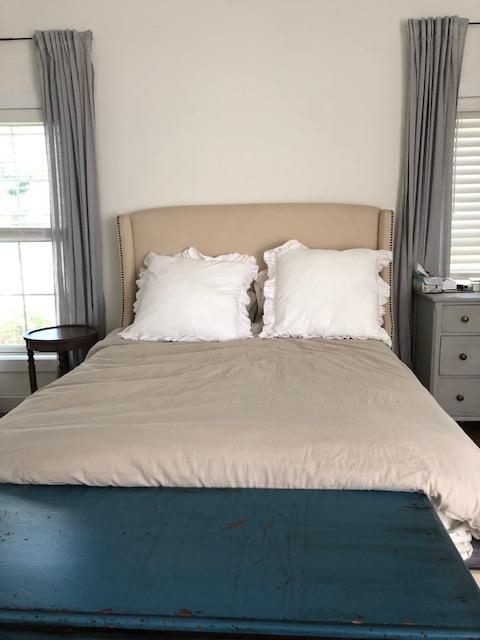
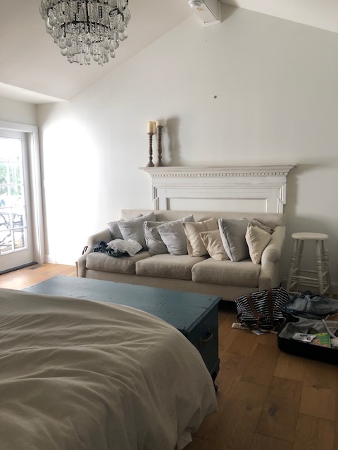
I was able to sell our chandelier and headboard which was great! I love that they found a new home and I could put some of that money I made towards the room.
Master Bedroom Design Reveal
When I started gathering inspiration for our bedroom what I knew I wanted most was a Canopy Style Bed. This one was the perfect look and price. It had that French Country feel, but also felt modern all the same time. Exactly what I wanted for the space.
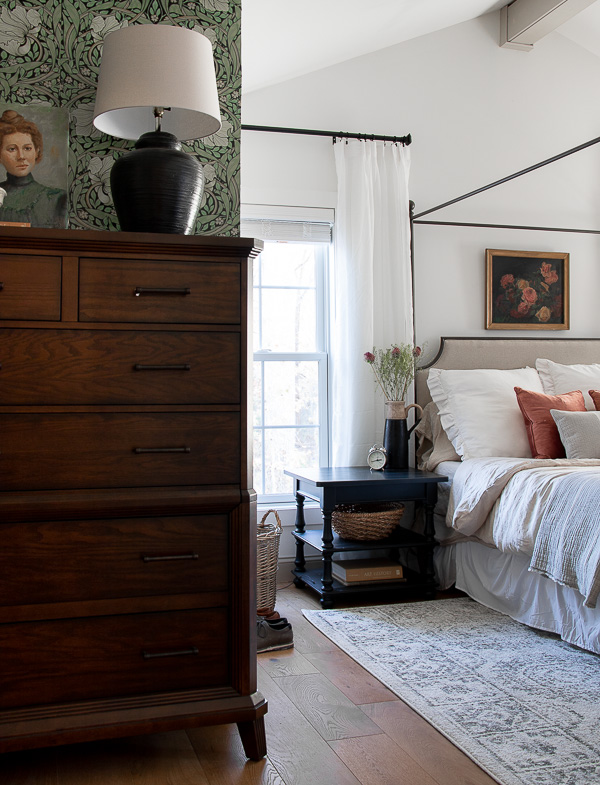
When shopping for the additional furniture I partnered with Raymour and Flanigan and though the first dresser did not work, the one that I replaced it with, was PERFECT! This dresser greets you when you walk into the space and you can see it from the living room with the door open. I love how it brings a masculine feel to the space and so much about it worked out even better then I could have thought. The best part there is a secrete jewelry drawer and my daughter is obsessed with that. She tells all her friends when they come over, check out this secret jewelry drawer-lol-.
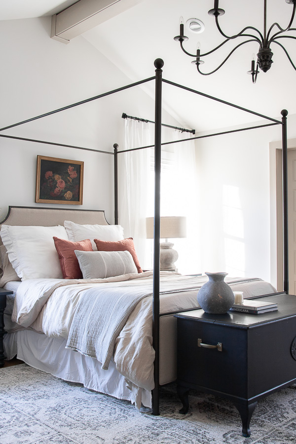
We decided to paint our beam the same as the trim and I love how it brings warmth to the ceiling. Nothing better then that amazing chandelier from Hudson Valley Lighting. It took my breath away when I took it out of the box. The color, style, and size just brought the room together. I mean the ambiance alone is so good!
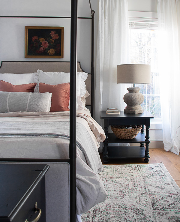
And then there was this rug from Loloi…it brought a modern pattern and some touches of black to the space. I knew I wanted a rug that would have black in it, to bring all the black accents together, and this one was just perfect because it did not make the room too dark having still a mostly white background. Also the plushness getting out of bed is so good. We needed something to warm up the space.

The wall art to the far left was a DIY project that I put together and the chest was a hand-me-down piece that I painted black.
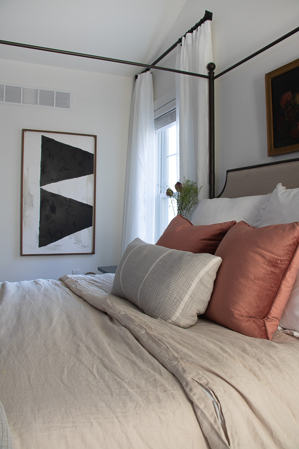
What really makes the space cozy and feel like a luxurious tream every time I jump into bed is the bedding from Garnet Hill. The linen is so soft and we matched the linen duvet with linen sheets- Ahhh-mazing! The throw and pillow cover were also just so perfect I love making the bed now.
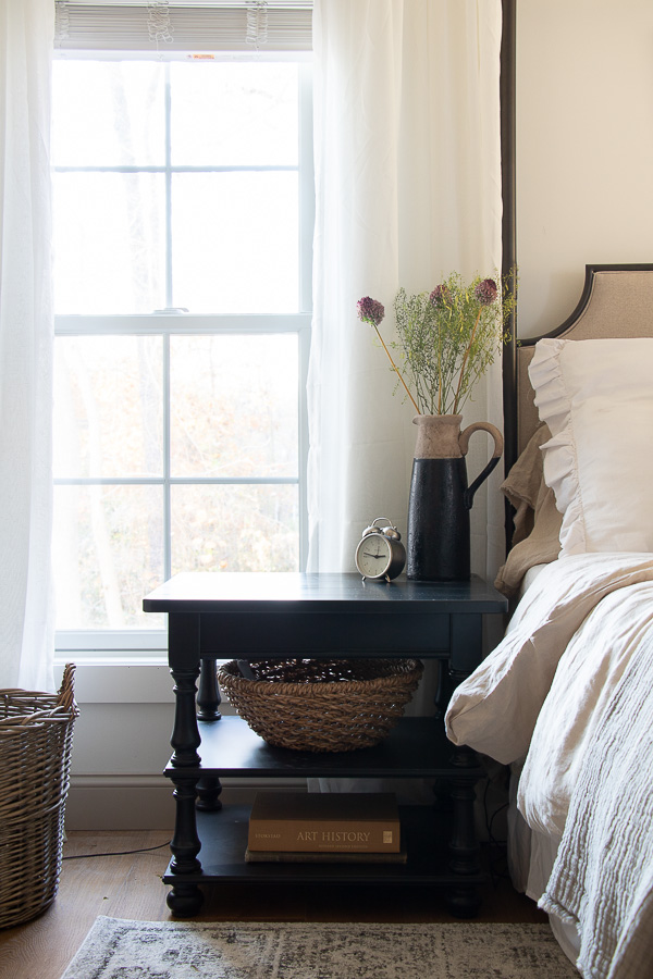
These side tables are better then I could have pictured too. I love the open shelves as they allow to have decorative storage options, and the height is perfect so we can see our elongated windows.
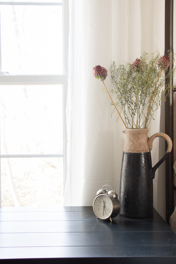
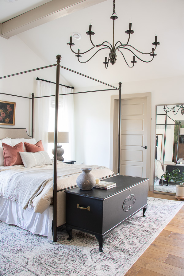
Oh and the other side of the room…
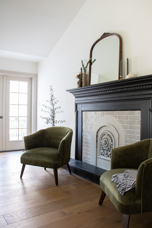
We can not miss the opportunity to talk about these green velvet chairs. They brought the green out in the space and they are perfect to sit and have coffee in or a place to put your shoes on in the morning.
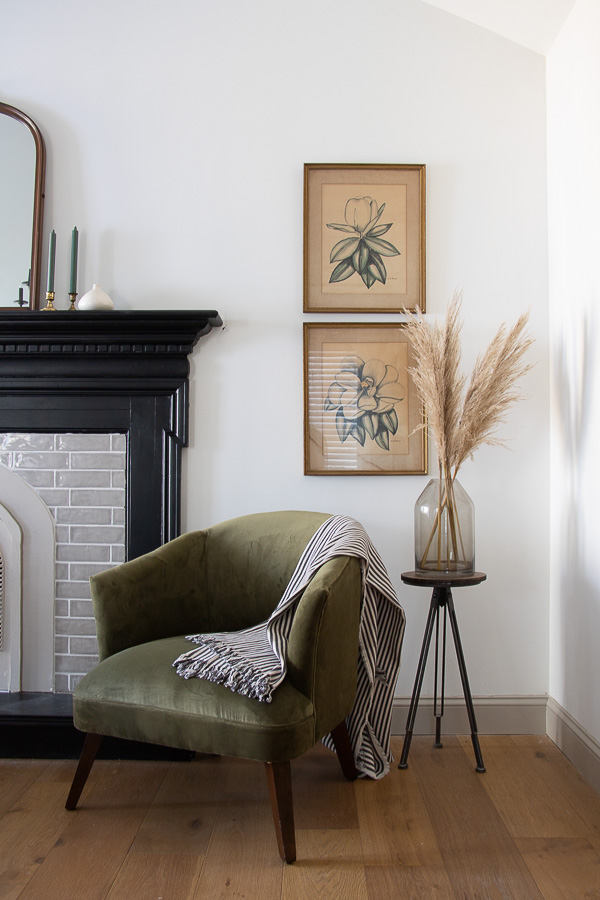
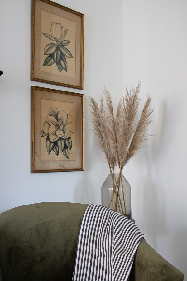
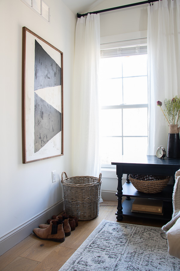
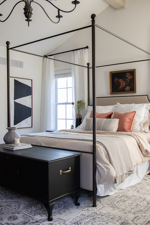
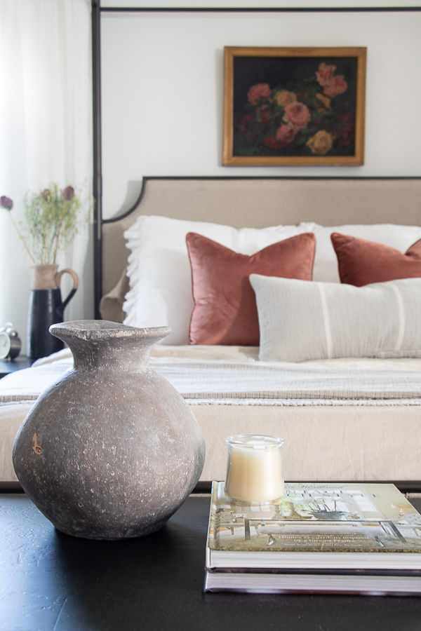
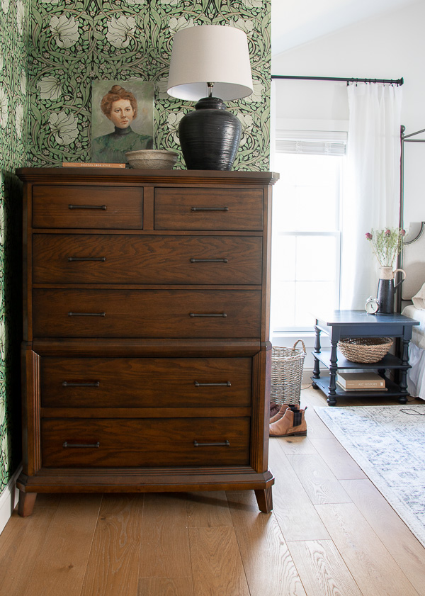
Well, that’s that! I am excited to be done and cozy up in this space all winter long. Not to mention decorate for Christmas in here! Thank you to the amazing sponsors that helped make this makeover possible.
Source List:
- Dresser–Raymour and Flanigan
- Side Tables– Raymour and Flanigan
- Green Velvet Chairs-Raymour and Flanigan
- Area Rug-Loloi Rugs
- Bedding (color pebble) Garnet Hill
- Throw Blanket-Garnet Hill
- Pink Pillows- TJMaxx
- All Artwork thrift-ed or DIY’d
- Wallpaper-Spoonflower
- Tall Mirror-Homegoods
- Black lamp- Thrifted
- Chandelier– Hudson Valley Lighting
- Hardwood Flooring- Avalon Flooring
- Paint Color: Benjamin Moore White Dove, trim: Stone Hearth
- Curtains
- Curtain Rods
Thanks to these amazing sponsors!

Please Pin


Deb, you bedroom makeover is just gorgeous. There are so many details that I love inducing the wallpaper, the fireplace and your beautiful bed. I love how rich and causally elegant the room feels. Fabulous job creating a beautiful space for the ORC.
Aw thank you so much Shelly! I feel like the space brought out all the design feels I wanted, vintage, modern, traditional, a touch of drama, and a touch of serene.
Deb, The bedroom makeover is beautiful. So cozy and elegant. It has inspired me to finally do ours over after 27 years!!!! The funny part is that what we have in there is vintage just needs some updating!!!
Thanks, Pam
So exciting Pam! Nothing like making a bedroom space feel refreshed.
Deb! This is fantastic! What a gorgeous space to curl up in and relax each evening!!
Thank you so much Amy!
I’ve followed along with your bedroom makeover and have marveled at every point. Your taste in bedroom decor is so like mine and your finished result is absolutely amazing.
One little aside – I too have a hidden jewelry drawer in a recently purchased dresser, and I think it’s pretty neat also. I’d never before seen one and definitely never had one. I don’t own or wear much jewelry, so it’s perfect to make my small stash of pretty things feel special. Thanks for sharing all your hard work. It was so worth it.
aw thank you so much Pat! It was a neat little detail I had never seen! I also don’t have much jewelry, but it’s better then in a bowl on my dresser with everything tangled.
Amazing how just a few simple changes can make such a big difference! Lovely room. Great job!
Thank you so much Joanne!
Absolutely gorgeous! Love the colors. Love the wallpaper. Love the pictures. and that fireplace!!! Amazing!!
(The vase at the end of the bed is making me nervous. lol)
Thanks Melissa! Ah I left the vase for picture sake, I’ll be removing as we know some things are better staged then lived with.
This is incredible! I would love tips on your thought process in designing this room. It perfectly combines elegance & simplicity!
Thank you so much Sherry!
I love everything you did Deb. Wow! Modern Elegance! It is light and airy yet warm and cozy. You truly have a gift!!! Bravo!
Thank you so much Cat! xoxo
It turned out so beautiful!!! My favorite part is the fire place! Such a beautiful addition to the room!
It turned out beautiful! What a serene and beautiful space to retreat too! Love it! Great job!
Nancy
So beautiful! Gotta love the Garnet Hill linens ? I have them the guest bedroom and I love them! I love the modern/classic mix you have going on. Well done!
What a Beautuful job you have done
So very Impressed!
It’s gorgeous, Deb! You did a beautiful job designing it. Now rest and enjoy it!
Iris recently posted…There’s a Skeleton in the Living Room!
beautiful work, deb! love the colors and that dresser nook is my fave!
Thank you cassie!
Just stunning?????. You are so very talented, Deb! ????????? Great job and in my book, you rose way above the challenge???…and your hubby did a great job on his part as well ?.
Lol thank you so much janine!
Your room is beautiful, I love everything about it!
Thank you Mary!
This room is simply gorgeous, Deb. Every single element blends together so effortlessly, lushly. When I pinned photos I took the liberty of editing the title as “Modern Spin on Traditional Master Bedroom Design.” You have good reason to be both proud and extremely comfortable with this classy redesign. Cheers and Happy Holidays, Ardith
aw thank you so much Ardith! I so appreciate the pins too!
It’s so gorgeous! I would expect nothing less. Love your style!
Thank you Marijean!
It looks so gorgeous and cozy!
Thank you Dianne
I love it SOOOO much!!! Just pinned a bunch of these pics, just gorgeous! So classy and grown-up, but plenty interesting with the great contrast between black and white, and rich character-filled texture!
Create/Enjoy (@suzannahstanley) recently posted…100% DIY modern traditional full bathroom reno REVEAL and budget: Week 6 of the One Room Challenge!
aw thank you so much Suzannah!
Deb… WoW !! Your master bedroom looks a-mazing !! I was following along during your makeover !!
You made it look easy… even when there was a hiccup !! The wallpaper is different and I said hmmmmmm… it is sooooo perfect. From corner to corner and above I absolutely LUV what you have done !! I have not seen that green for mannnny years, looks perfect !! The faux fireplace— so creative. THanK. YoU for sharing the journey, Your uncle’s(?) cedar chest looks great at the foot of your bed.
hugs?linda of no.cal.
It’s all so beautiful Deb! I love the fireplace and the beautiful green chairs! The canopy bed and the light are gorgeous. My favorite is the William Morris wallpaper.
This is the prettiest and coziest bedroom I’ve seen in a long time. Well done!!!
Wow, that canopy bed is beautiful! I love the wallpaper and artwork. Amazing ❤️
That Morris wallpaper and the portrait of the woman against it — I just love it! Beautiful!
Angela | MidModernMama recently posted…Week Six | November 7 | A Place for Everything
Beautiful new bedroom! The seating area is really nice and the wallpaper is definitely a winner. (I love the vase with the pampas grass in it)